Marketing and conversion optimization go hand in hand. You can invest heavily in marketing campaigns to drive traffic to your site, but if your website has a low conversion rate, you’ll end up with a poor ROI and ROAS.
Conversion rate optimization (CRO) is the backbone of marketing. You can do wonders even with minimal traffic by conversion optimization.
This article explores how to do it for massive business growth.
What is Conversion Rate Optimization?
Conversion rate optimization (CRO) is a systematic process of increasing the conversion rate of a website or app. It focuses on increasing the percentage of visitors who complete a specific action such as adding a product to the cart or filling and submitting a form.
In simple words, CRO focuses on optimizing your website’s conversion rate. A high conversion rate leads to more sales and revenue.
To fully understand conversion rate optimization, you have to understand a few basic concepts:
- Conversion: When a website visitor takes a desired action on a website such as signing up for a newsletter
- Conversion rate (CVR): The percentage of visitors who complete the desired action and convert. It is measured by dividing the total number of visitors who take an action by total visitors and multiplying it by 100 to achieve a percentage.
Let’s take an example.
You have a squeeze page to collect email addresses. The conversion action on the squeeze page would be to add an email address and click submit. This is what a squeeze page looks like:
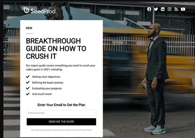
If you send 100 visitors to this squeeze page and 20 people submit their email addresses, you have 20 conversions. The conversion rate will be:
CVR = (20/100) x 100 = 20%
Now, you change the featured image on the squeeze page and it increases the conversion rate to 22%, that’s what we call conversion rate optimization. You have optimized the squeeze page to increase its conversion rate and the page converts better with the same amount of traffic.
Conversion Rate Optimization Benefits
Here’s a quick breakdown of the top benefits of CRO and why you should focus on it:
- More leads and sales: Optimizing your website for conversions increases leads and sales without having to increase the marketing budget
- A better understanding of your ideal customers: CRO is highly data-driven as it is driven by experiments. This helps you know your customers better and you can update buyer personas based on data that helps improve targeting
- Low customer acquisition cost (CAC): CRO reduces CAC as you convert more visitors without increasing your marketing budget. A reduction in CAC increases customer lifetime value (CLV) which means you earn more per customer
- Improve overall marketing ROI: CRO impacts the performance of all marketing campaigns across all channels including paid and organic. For example, CRO experiments reveal that the purple color CTA button has the highest conversion rate on your website. You can implement it across all landing pages and boost conversion rates and marketing ROI
- More revenue with the same traffic: You can significantly increase revenue with the same amount of website traffic with CRO.
Conversion Rate Optimization Tactics
CRO is technical and requires everyone in your team to work collectively as a whole. You need an analytics team to come up with hypotheses, you need a marketing team to implement experiments, the design and marketing teams need to tweak the design and content, and the tech team manages the backend.
The following proven tactics can help your teams with conversion rate optimization and you will save tons of resources:
1. Increase Page Load Speed
Your website’s speed has a direct impact on conversion rate. Slow sites result in a poor UX which leads to a low conversion rate as reported in this study.
A website that loads in 1 second has 3x higher conversion rate than sites that load in 5 seconds and 5x higher conversions than sites that load in 10 seconds:
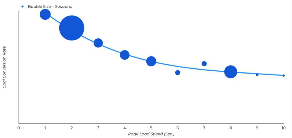
Visitors don’t like to wait for a site to load. As much as 57% of people leave a site if it takes longer than 3 seconds to load and 80% of them will never return.
A slow website is disastrous.
Here’s the good news: Increasing your site’s speed should be the first hypothesis for CRO. It is a scientifically proven hypothesis with rationale making it easy to increase conversions.
Measuring your site’s speed is quite easy. PageSpeed Insights lets you track load speed and Core Web Vitals free of cost. You get detailed output with recommendations on how to improve speed and what elements have the highest impact on loading speed.
Follow these best practices to improve your site speed and increase your conversion rate exponentially:
- Use PageSpeed Insights to measure your site’s load time and ensure that the performance score is above 90 (green) for both mobile and desktop
- Compress images, apply lazy load, and use webp format to improve load speed
- Use browser caching
- Minify CSS and JavaScript
- Remove unwanted scripts which means you have to remove unwanted plugins and widgets and stick with the necessary codes
- Use a content delivery network as it significantly increases your site’s speed
- Switch to a reliable hosting company and choose a dedicated hosting account.
Ideally, you should implement all or most of these recommendations and then compare the post vs. pre-conversion rate. You don’t have to necessarily run A/B tests for load speed as it doesn’t make sense to revert changes and move back to a slower site if the test fails.
This is because site load speed is part of Core Web Vitals that Google uses to measure UX which is a ranking factor as discussed here.
So, having a fast website is a must and it should be your first step in the CRO process – everything comes second.
2. Optimize Call to Action
The call to action (CTA) button or text is where the actual conversion happens. It is the start of a visitor’s journey towards conversion. The CTA should be persuasive and it should grab attention instantly to drive clicks.
You can create one of the best landing pages with top-notch content, images, and offers, if CTA doesn’t stand out or it’s not persuasive enough, the landing page won’t convert well. It all comes down to the call to action.
Unfortunately, there isn’t any straightforward, proven way to create CTAs. Yes, there are a lot of industry best practices for CTAs such as contrasting color, white space, action-oriented copy, and more. You can’t rely on these best practices without testing.
You have to figure out what type of CTAs your target audience likes interacting with and that might be the opposite of what most marketers are doing.
For example, adding CTA above the fold is a common practice as it allows visitors to convert instantly without scrolling. Michael Aagaard did the opposite by moving CTA from the top of a long-form landing page to the bottom and it increased conversions by 304%:
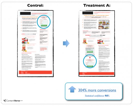
It shows that CTAs are tricky and need attention and experimentation.
There are a lot of variables that need to be tested for CTA effectiveness and CTR:
- Button vs. text
- Color scheme
- Placement
- Shape and style
- Copy
- Whitespace.
You need to create data-driven and scientifically proven hypotheses to test CTAs. Here’s how to create scientifically sound hypotheses for A/B tests:
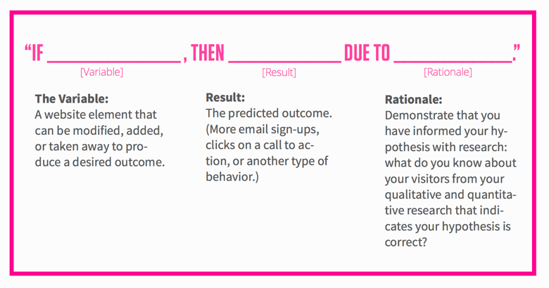
The idea is to find what type of CTA your audience interacts with. Sticking with best practices is a good idea but don’t stop there, keep testing for improvement.
3. Use Social Proof
It is a psychological phenomenon where people tend to follow and copy other people’s behavior and actions when they don’t know how to behave in a situation. They also do it to fit into a group and be part of it – instead of being left alone.
Social proof is used extensively in marketing to boost conversions. It includes customer reviews, testimonials, expert endorsements, certifications and awards, and recommendations by family and friends.
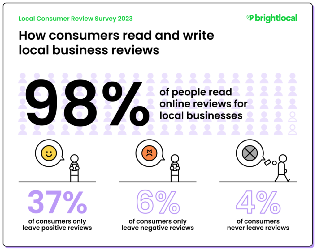
Customer reviews, for example, are a major form of social proof that’s reported by 93% of consumers to play a major role in their purchase decisions. As much as 98% of people read online reviews for local businesses:
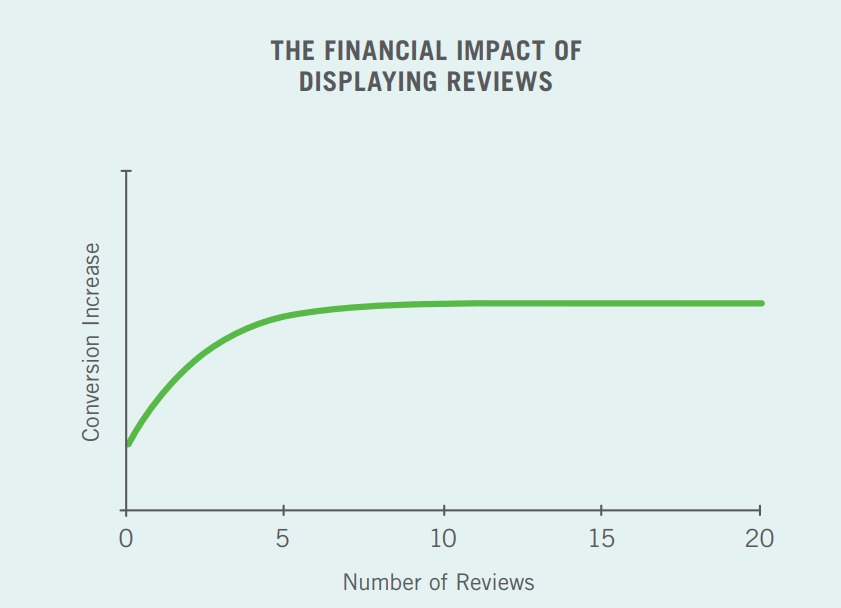
A case study by VWO reported that adding testimonials on a sales page increased the conversion rate by a whopping 34%. Other forms of social proof have a similar impact on conversion rate. Another study found that adding reviews to a landing page or website increases conversions by 270%. The purchase likelihood of a product having at least 5 reviews is 270% higher than a product with zero reviews:
You should add social proof to your website, landing pages, sales pages, and other marketing pages to lift your conversion rate. Not all social proof types work equally well and their placement and other factors also influence conversions. So, you need to run A/B tests to figure out the best type of social proof for your brand.
4. Optimize Checkout Process
Studies have shown that people don’t like creating an account on a site during the checkout process. Cart abandonment is a serious issue that leads to low conversions.
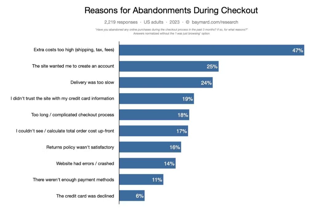
As much as 25% of people said that they abandon a cart if the site wants them to create an account and another 18% leave a site if the checkout process is too complicated or long:
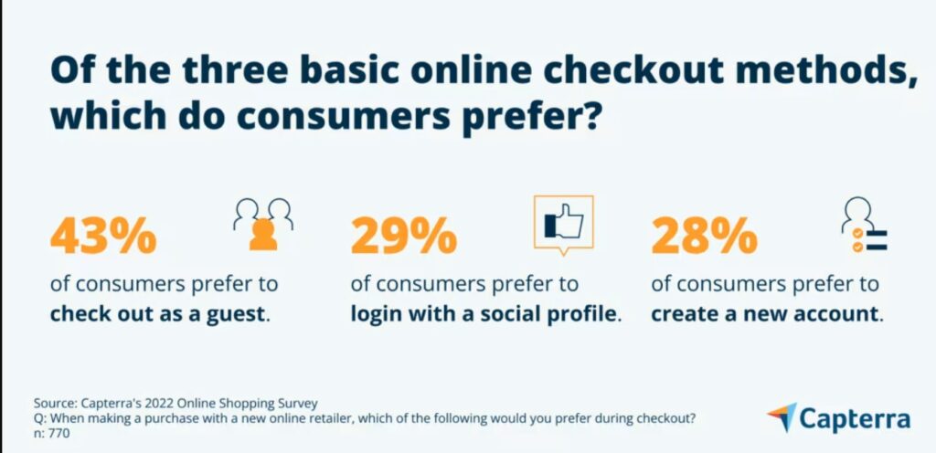
Another study reported that 43% of consumers prefer guest checkout and 29% like to log in with a social profile. It shows that consumers prefer a seamless and quick checkout process to get what they want.
Not having a guest checkout means you’ll have 50% fewer conversions and a lot of unhappy customers. You might not lose all the customers but the ones who convert, might not be too happy with your checkout process.
The checkout process needs to be quick with minimal steps. Up to 66% of people expect the checkout process to finish in less than 4 minutes:
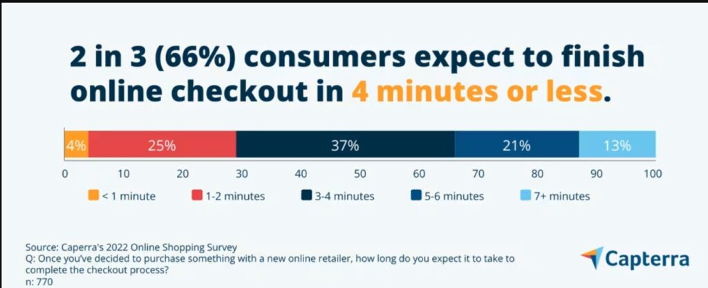
The basic rule for a high conversion rate is to improve UX and make it easy for visitors to get what they want. Here are a few tips and techniques to stick with this conversion rule when optimizing the checkout process:
- Keep the checkout process simple and clean
- Use a single-page checkout instead of multi-page or multi-step
- If you have to use a multi-step checkout, use a progress bar to keep users updated on the remaining stages in the process
- Offer guest checkout
- Let users create an account with social accounts.
5. Add Multiple Payment Options
A seamless and quick checkout process without multiple payment options fails. If you don’t offer more than one payment option to the customers during checkout, your conversion rate will decline with a high cart abandonment.
Sales conversions are high value so optimizing them should be your top priority.
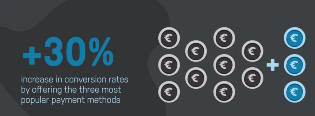
Some 11% of customers abandon a cart due to lack of enough payment methods and another 6% leave when their card is declined and have no other option to pay. You can increase the conversion rate by 30% if you offer the three most popular payment methods:
A study asked respondents what their preferred online payment method is and here’s what it concluded:
- Apple or Google Pay (68%)
- Debit and credit card (29%)
- Open banking (3%).
Another study reported that people in North America trust their primary bank the most followed by card networks:
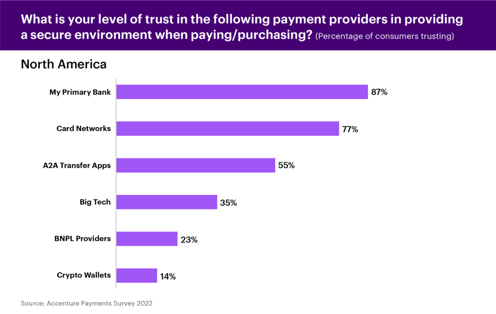
Ideally, you should add more than one payment method. The more payment options you have, the better. This improves the conversion rate in two distinct ways:
- Your ideal customers can choose the payment method they find fit. And in cases where one method fails, visitors can pay through another method and you don’t lose conversion
- It builds trust and authenticity. When potential customers see multiple payment methods including popular ones like PayPal, they feel safe and secure.
You also need to add and test different trust badges as they play a crucial role in building visitor trust. A survey found that 48% of customers perceive the site to be secure and trustworthy if it displays trust badges and this makes them share their financial details with your site comfortably:
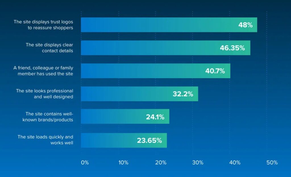
Multiple payment methods coupled with trust seals help you convert more visitors into customers. Implement this CRO technique and then test it further to find the best payment methods and trust seals for your audience.
6. Reduce the Number of Fields in Forms
Almost all types of conversions require filling out and submitting a form. Whether it is a lead generation or a sale, the visitor needs to add details (e.g., email address) to complete the conversion process.
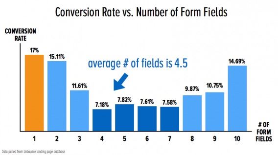
The way you design the form and the number of fields impact the conversion rate. A study reported that forms having a single field have the highest conversion rate and as the number of fields is increased, the conversion rate reduces:
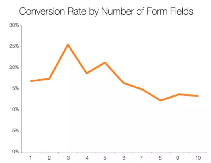
Another study reported that forms with 3 fields have the highest conversion rate:
You should remove fields that aren’t necessary. For example, if you are collecting email addresses for a newsletter, you don’t have to ask for country or gender as this information isn’t needed for newsletter campaigns.
There are other form-related CRO techniques and best practices that you should incorporate to improve form conversion rate:
- Remove unnecessary form fields. Don’t collect information you don’t intend to use
- Highlight required fields (with an asterisk)
- Add privacy statement to increase trust
- Use a single column for your form and properly align labels
- If you have a long form (e.g., service businesses usually need longer forms), convert it into a multi-page or multi-step as it boosts the conversion rate
- Add ample white space between fields
- Optimize CTA button
- Use inline validation.
7. Ad, Landing Page, and Offer Relevance
One of the common reasons for the low conversion rate is the lack of relevance between the ad, landing page, and offer. This is a goldmine for CRO as fixing it leads to an instant boost in conversion rate.
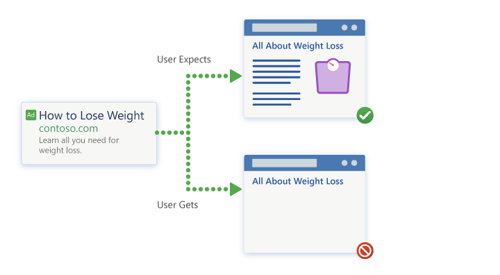
The traffic source that sends visitors to a landing page should be perfectly aligned. This means the landing page should be exactly what a visitor expects. If it doesn’t meet expectations, you’ll have a significantly low conversion rate despite having the best offer.
Here’s an example of how the traffic source, landing page, and offer should align:
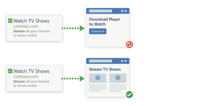
Here’s another example of how a lack of relevance between traffic source and landing page ruins conversion rate:
The best thing about aligning ad, page, and offer is that it’s straightforward and doesn’t require a lot of testing like other conversion rate optimization tactics. Here’s how to ensure relevance:
- Have one offer per landing page
- Your landing pages should have a single purpose and each one must promote or cover a single offer
- The landing page copy should be aligned with the offer it promotes
- Traffic sources must set clear expectations of the visitors without creating any hype
- The ad and page headline must promote the same offer
- Use similar wording in the ad and landing page copy to avoid ambiguities.
8. Offer Live Chat
A simple but highly effective CRO tactic is to use live chat on your site. It is known to increase conversion rate, visitor engagement, and revenue.
A study found that adding a live chat feature to a website increases the conversion rate by 12% and visitors who use live chat are 2.8x more likely to convert. People who use live chat have a 305% higher average ROI rate than those who don’t:
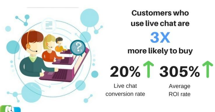
This is because live chat offers immediate support to potential customers and they get answers instantly. It helps visitors in decision-making. This is a reason conversion probability increases by 250% when a visitor exchanges 6 messages:
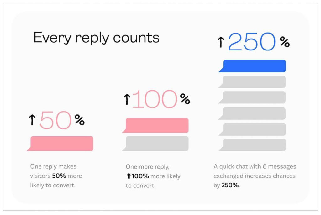
Offer 24/7 live chat on your site and it should include both chatbot and human agents. Address common questions and help them in making the right purchase decision.
9. Offer Free Shipping
Nothing works better than free shipping to generate sales. It is the number one preference of online shoppers.
Up to 66% of people expect free shipping on all their online purchases, 90% of people opt for online shopping because of free shipping, and 84% of consumers buy a product specifically to avail free shipping. This helps your brand increase sales by 10%, orders by 90%, average order value by 30%, and conversion rate by 20%:
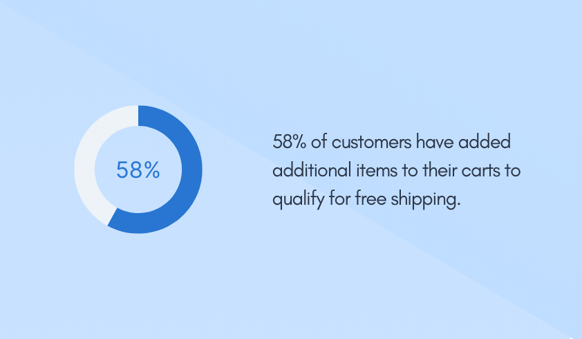
If you don’t offer free shipping, 48% of potential customers will abandon their carts leading to a significant decline in conversions and sales. So, free shipping is a must-have.
It isn’t, however, possible to offer free shipping for all the products. You need to try and test different types of free shipping methods to optimize conversions:
- Offer flat free shipping
- Add free shipping to specific products
- Give free shipping to certain locations
- Free shipping for a certain spending limit
- Give free shipping offer to first-time customers
- Limited-time free shipping.
10. Optimize Headings
The first thing that a visitor reads on a webpage is the title and heading. If the title is persuasive and it grabs the attention, the journey continues. But if the heading fails to do its job, most visitors will leave your website within a few seconds after landing.
All the headings and subheadings on the landing page are crucial for conversion as they keep visitors hooked and help them convert. Most people only read headlines and don’t bother too much about the content:
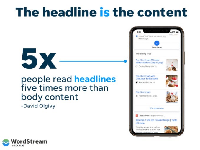
Page title, headings, and subheadings should be consistent and must promote the offer. Visitors lose interest and often find themselves lost when they see different types of headlines promoting more than one offer.
The title and headlines also need to be consistent with the copy. The headline should be a reflection of the content. It sets clear expectations leading to a higher conversion rate.
Follow these best practices to create high-converting headings:
- The headings should align with the product, body, and title
- Write descriptive headlines so that people can skim your page effortlessly
- Adding a number in the headline increases its conversion rate
- Add power and action words to grab the reader’s attention.
Conversion Rate Optimization is a Continuous Process
CRO is a never-ending process. It requires constant iterations to improve conversions.
You never know the maximum attainable conversion rate of a landing page unless you test every single element. What you consider a decent conversion rate might be the beginning of a new high. The only way to find out if you have achieved the highest possible conversion rate is through experimentation.
You need to compare your site’s conversion rate with industry benchmarks to get an idea of where you stand. Use Dynamic Yield’s benchmarks to find the average conversion rate for comparison.
Featured Image: Unsplash


