A product page on an ecommerce site is the page where potential customers take action and become customers. It’s where the journey begins.
Optimizing a product page improves search visibility, ranking, organic traffic, and UX.
Unfortunately, most ecommerce stores spend little time on product page optimization. They stick with the default settings, don’t add significant unique content, and don’t go the extra mile to make their product pages search-friendly.
This eventually backfires in the long run where your product pages don’t drive organic traffic.
This 10-step ecommerce product page optimization checklist will provide you with actionable tips and techniques to create an optimized product page that ranks high in search results and delivers an exceptional user experience.
1. Optimize Product Tile
Product title is the most crucial element that plays a major role in product page optimization.
It is instantly visible to the visitors and plays a major role in keeping visitors hooked and conversions.
Title tag or product title appears in search results, throughout your site, and at the top of the browser. It needs to be optimized for both search engines and target audience:

Potential customers see product titles in their browsers:

Search engines use title tags to understand what a page is about which helps crawlers in indexing and ranking.
Product title is your main headline which 80% of people read but only 20% will read the next part. It is much more than a superficial and filler element that you just have to do for the sake of it.
No.
The title tag persuades searchers to click your link and when they land on the product page, it pushes them to scroll down and read the product description and other parts.
It needs to be catchy and persuasive. It should hook readers and grab their attention immediately. Follow these guidelines to make your title tag stand out:
- Write a short and clear title tag
- Your product title should have between 20-70 characters. Ideally, keep it around 60 characters to avoid getting it stripped in the SERPs
- It should have a complete product name
- Use H1 for the product title and ensure that it is visible instantly to the visitors
- Avoid typos, punctations, symbols, and special characters in product title
- Make it descriptive yet catchy. Don’t overdo it
- Avoid stuffing product title with unnecessary keywords
- It must have your brand name either at the start or end. Don’t put it in the middle
- Use unique product titles for similar products or product variations. Add the key differentiator of a product variation in the title for effective product page optimization.
2. High Quality Product Images
Product photos are an essential part of an ecommerce product page. Images help your audience get a better understanding of your product and its features.
Research shows that high quality product images increase conversion rate by a whopping 94%. A 42% of mobile users say that 360-degree product image is more likely to persuade them to make a purchase:
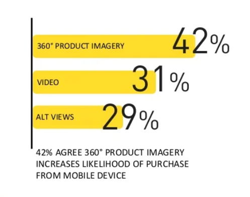
Product images play a major role in enticing visitors to make a decision.
On the flip side, images impact search rankings too. Images rank in SERPs to help you drive additional traffic from Google Photos and Lens. Image search is getting more popular by the day. Google Lens, for instance, has more than 12 billion visual searches a month.
Up to 36% of people say that they have used visual search when shopping online and another 74% of consumers say that text search is ineffective in finding the right products they want to buy:

Product images provide essential information to web crawlers that improve image visibility in search. Follow these guidelines to improve product image optimization for your ecommerce product pages:
- Use high quality product images
- Cover the entire product from all sides so that potential buyers can get a better idea of it
- Use 360-degree images, if possible
- Make sure that photos aren’t aggressively edited. Try to keep them as original as possible
- Add descriptive alt text to all the images
- Avoid stuffing keywords in the alt text
- Add relevant and descriptive file names for images
- Use responsive and retina-ready images
- Compress image files and prefer using webp format.
3. Product Video
Video is essential for engagement and conversions. Product videos rank in search engines and drive organic traffic. If you can afford it, consider adding at least one product video to the product page.
A study reported that 73% of people say that they are more likely to purchase a product after watching a video that explains how to use it and 44% say that they purchase more frequently from ecommerce stores that have product videos:
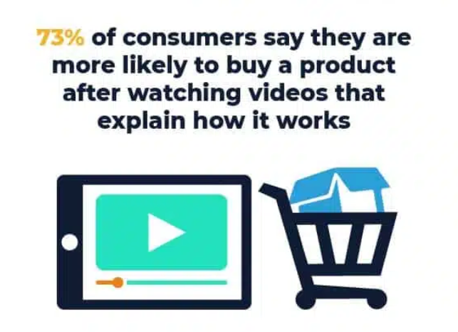
When it comes to search, video search is now taking over text-based search. A study reported that Gen Z uses TikTok to find products they are looking for and 74% of Gen Z don’t use Google anymore to find what they are looking for.
This means video content helps you drive traffic from multiple sources including social media, Google Discover, and video search.
Videos on your product page boost the conversion rate significantly. It helps your audience get to know the product better and if they find a fit, they’ll purchase it instantly.
Product videos also reduce returns and refunds as video content is more realistic than images. You can set the right expectations with product videos and reduce returns and unhappy customers significantly.
Here’s a list of best practices you should follow to optimize product videos:
- Record high-quality, professional video
- Make it publicly accessible
- Add a call to action in the video
- Add transcript
- Use a relevant, engaging thumbnail
- The video should explain product features and how to use it without any hype
- Show your product in a realistic and natural environment
- Add video to social media platforms for more reach
- Allow visitors to share video on social platforms
- Avoid auto-play as it ruins UX.
4. Price and Rating
Price, product rating, availability, product variations, reviews, and other basic details about the product should be visible with the product image/video above the fold. You can add these details either on the left or right side of the product images:
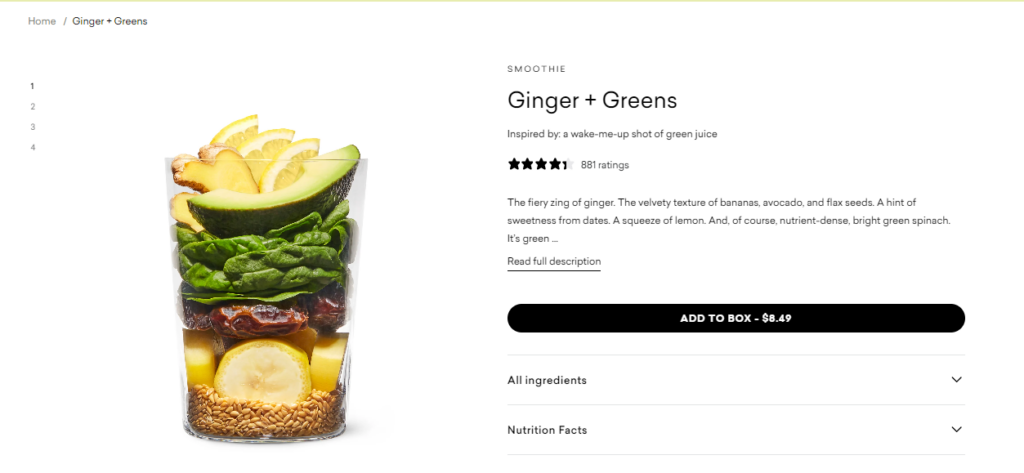
Here’s what should be added in this section that’s visible to the visitors without scroll:
- Product star rating right
- Enticing subheading
- A short description that highlights your product’s USP
- Product price
- Additional details such as ingredients, specifications, etc.
- Variation and attribute options for product customization
- A clear, catchy, and appealing call to action (CTA) button.
Most of the popular ecommerce platforms like Shopify, WooCommerce, and CMS have this section prebuilt that can be customized. This means two things:
- Less work to do at your end
- You need to ensure you have these elements on the product page as this is what your ideal customers expect to see above the fold (as it’s pretty common across all platforms).
You can also add product schema here to further optimize product price and ratings. This, however, depends on the theme you are using.
If your theme allows schema markup, add it as it gets easier for search engine crawlers to understand and show them in SERPs. It significantly increases CTR.
Research shows that rich results receive 58% clicks while non-rich results receive 41% clicks on average and another study reported that schema results have 40% higher organic CTR.
Here’s an example of how both results show in SERPs:
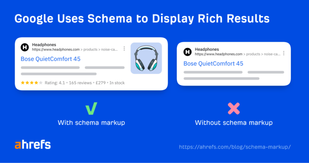
Schema makes search results visually pleasing and offers more information to the users. This increases organic CTR.
5. Product Description
This is an important section on an ecommerce product page for two main reasons:
- It helps you provide additional details to the potential customers
- You can add relevant keywords and search terms in the product description to improve ranking.
Generally, it gets very hard to incorporate keywords in product title, subheadings, and other sections that go above the fold. Product description is the main part that can be used to improve search visibility.
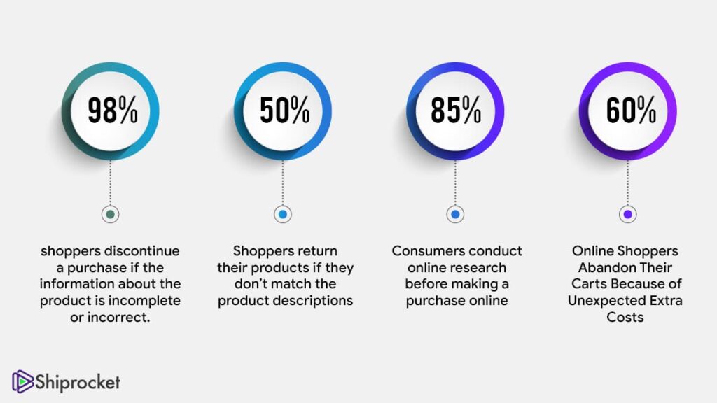
Consumers read product descriptions to better understand product benefits and features. Statistics show 98% of buyers discontinue purchase if product information is complete or incorrect and 50% of buyers return the product if it doesn’t match the product description:
Almost all the visitors on your product page who are interested in buying read the product description so it makes a lot of difference in conversions.
Here’s a list of guidelines to optimize product description for both readers and search engines:
- Identify top keywords that your target audience uses to find products in search engines. Add these keywords in the product description to improve search visibility
- Focus on benefits instead of features. Write detailed benefits of your product that the end user receives
- Add images and videos in the product description to enhance engagement and comprehension
- Distribute product description into different sections. Use subheadings, bullets, and lists to make it easy to read
- Address common questions about your product
- Explain how to use the product for optimal results.
6. Social Proof
Adding social proof to an ecommerce product page is a sure way to boost conversions as 92% of people trust customer reviews. Studies have shown that social proof increases conversion rate by 270% and sales by 18%.
You can’t go without it.
There are multiple ways to add social proof to your product page:
- Add reviews and ratings
- Incorporate detailed customer testimonials right below the product description
- Add a product counter that shows the total number of products sold
- Mention product endorsements by celebrities and experts (if any)
- User-generated content.
Here’s an example of social proof on a product page:
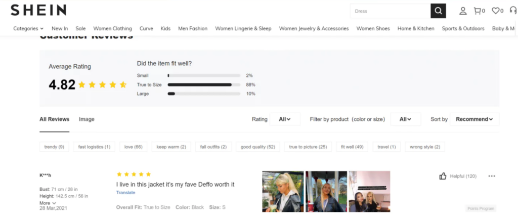
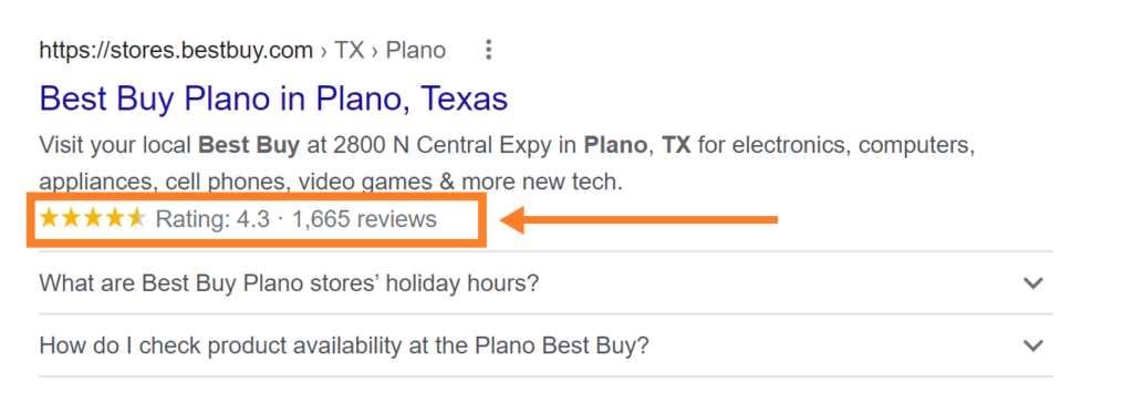
Social proof might not help you improve search visibility but it helps you improve conversions and sales. If you consider adding a product review schema, it’ll be visible in search results like this:
Other types of social proof improve UX, conversions, and engagement. All these metrics indirectly impact search rankings as visitors will spend more time on your product page with fewer bounces. This indicates to search engines that your product page is high quality and does a good job of engaging and hooking visitors.
This is one way to improve search ranking.
Search engines boost the ranking of pages that have low bounce rates and high engagement.
7. Add FAQs
Addressing common questions towards the end of your product page is a perfect way to target long-tail keywords that you can’t mention anywhere else on the page.
Most long-tail keywords start from what, how, when, where, etc.
Here’s an example:
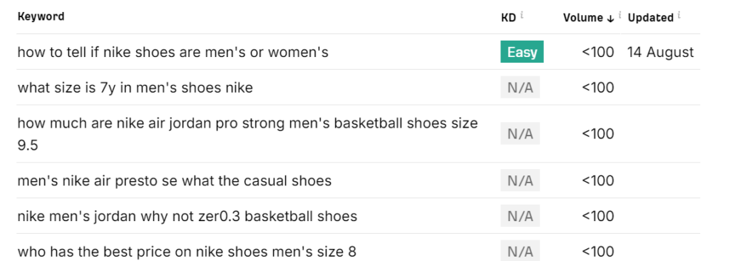
A FAQ section is ideal for targeting relevant keywords and improving search ranking. You can add a FAQs section towards the end of the product page or merge it with the product description.
Questions you answer should be meaningful and relevant to your product. These should be actual questions and concerns that potential buyers might have. This section needs to be helpful and valuable for potential buyers so it improves their experience and boosts conversions.
Follow these best practices to craft a compelling and optimized FAQ section for a product page:
- Target long-tail relevant keywords
- Add value instead of merely focusing on SEO and optimization
- Address genuine queries of potential buyers to help them make the right choice
- Avoid repetition. Don’t answer the same questions you have already answered in the product description or any other section
- If you don’t have any questions to answer, skip this section.
8. SEO-Friendly URL
One of the basic elements of an optimized product page is a simple and user-friendly URL.
Google recommends having simple, relatable, and readable words in the URL instead of adding long numbers that don’t make any sense:
“… Create a simple URL structure. Consider organizing your content so that URLs are constructed logically and in a manner that is most intelligible to humans. Wherever possible, avoid the use of session IDs in URLs and shorten URLs by trimming unnecessary parameters.”
For ecommerce sites, Google recommends having a clean URL structure as it helps its spiders crawl and index your store easily:
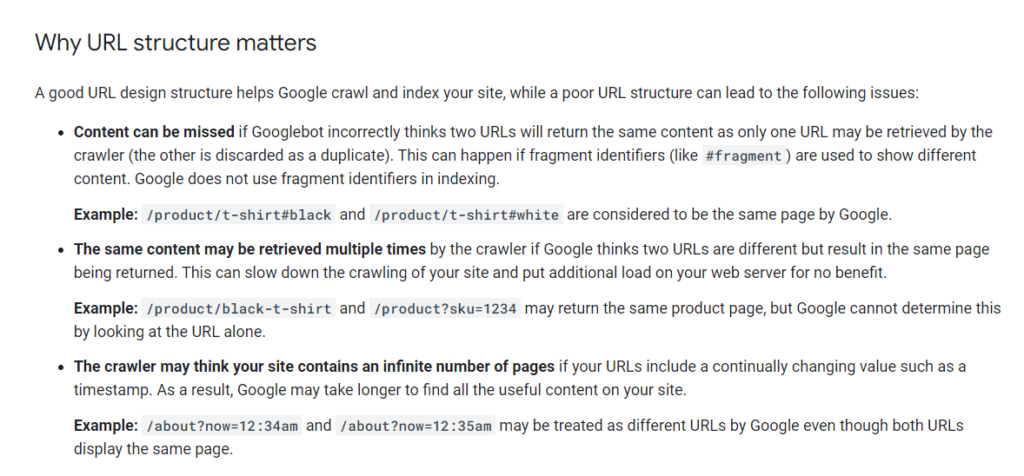
You might end up missing product pages in SERPs due to URL issues and it’ll eventually lead to low organic traffic.
The major benefit of using friendly and simple URLs for a product page is that it helps you know what the page is about, it helps crawlers better understand the page and its content, and it helps your ideal customers get to know where they are on your store.
If a potential buyer is on your site with a URL that looks like this:
www.mystore.com/product/AbhS0069-11nCOO0#001563dfdbmyk
It doesn’t provide any information to the visitor as opposed to the following URL:
www.mystore.com/t-shirts/men-t-shirts/
It is a clean and readable URL that makes sense and tells visitors where they are on your store.
At the end of the day, it makes a huge difference.
You might not see URL structure as a challenge when you have a small ecommerce store with limited products and variations. But as your business grows, you’ll have hundreds and thousands of products with numerous variations, that’d be the time when it’ll become a mess.
It’s best to start logically and in a manageable way from day one.
Follow these best practices to write optimized URLs for your ecommerce product page:
- Use words relevant to the product in the URL. Consider adding keywords that describe your product or variation
- Keep URLs short. You don’t have to use the entire page title as a URL rather trim it and use the primary keyword in the URL
- Your URLs need to be distinct. If you have similar products, use different URLs for all of them that are clearly distinguishable
- Avoid adding irrelevant words, numbers, or special characters
- Define a structure for URL creation and follow it. This ensures you have a consistent URL structure that won’t create issues for your store even if it gets bigger
- Use hyphens instead of underscore or other characters to separate words. Hyphens make the URL readable.
9. Add Breadcrumb
A simple and effective way to guide visitors through your store is via breadcrumbs.
A breadcrumb helps store visitors navigate easily and it helps them know their current location on the store:
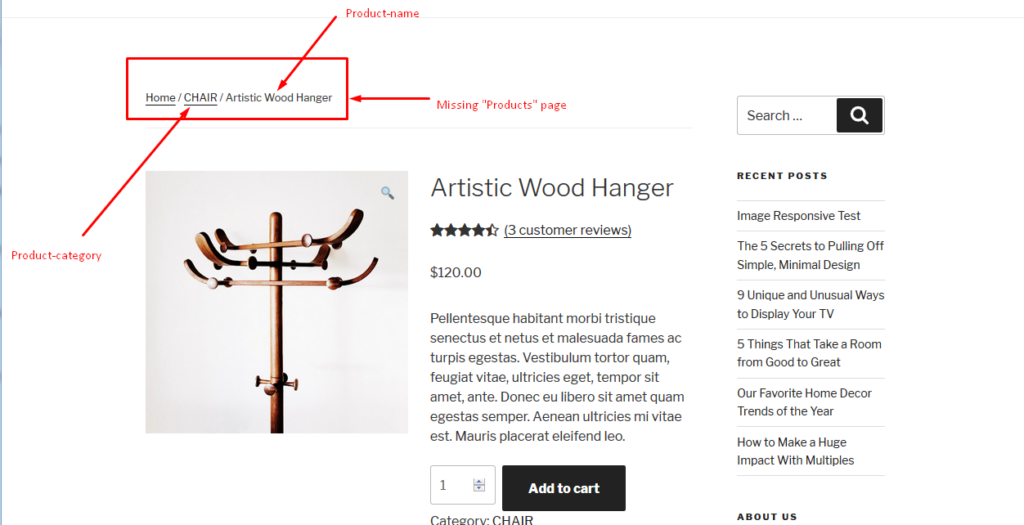
Visitors can switch back to the product category from a product page right from the breadcrumb. It gives them an additional and quick way to move between different sections of your store.
Breadcrumbs also help search crawlers understand the structure of your site. If you have descriptive breadcrumbs, it indicates that you have a clearly defined store hierarchy and URL structure (which Google recommends).
You can’t have logical breadcrumbs if your site’s structure isn’t organized.
So, you need to first define URL structure and then use breadcrumbs to improve UX and crawling.
Here’s a list of the best ways to use breadcrumbs on a product page for better optimization:
- Use descriptive URL structure for readable breadcrumbs
- Breadcrumbs are inherited from your URL structure so make sure it’s clean and reader-friendly (see previous section)
- Use a consistent format and style throughout your store
- Highlight the current page to guide the user where they are currently
- Add clickable links in the breadcrumb to allow visitors to navigate effortlessly
- Use schema markup for breadcrumbs to improve search visibility.
10. Improve Page Load Speed
The speed with which your product page loads is an essential optimization element. It impacts both rankings and UX.
Statistics show that a website that loads in 1 second has 3x more conversions than sites that take 5 seconds to load. Around 57% of visitors leave a site if takes more than 3 seconds to load:
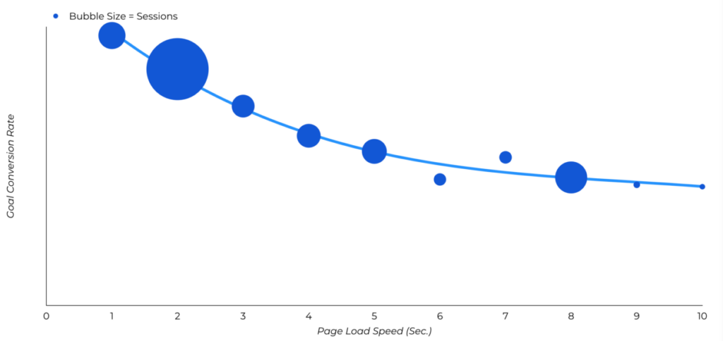
Ecommerce conversion rate drops significantly if your site takes 3 seconds or more to load. Stores that load in a second have the highest conversion rate (up to 3.05%):
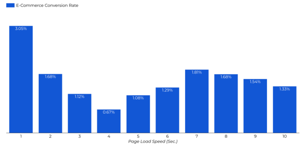
A 1-2 second load time is ideal for a product page as it delivers optimal UX.
You can track page load speed through PageSpeed Insights (a free tool by Google). It evaluates URLs based on 3 key metrics which are collectively known as Core Web Vitals. These metrics measure UX on your product page through these metrics:
- LCP which tracks page load performance
- INP measures browser response time
- CLS tracks visual stability.
These metrics collectively measure load speed and Google considers Core Web Vitals as a ranking factor. This means sites and pages that have poor Core Web Vitals will have a hard time getting to page 1 in SERPS.
The PageSpeed Insights tool and Google Search Console both provide you with actionable insights on how your store’s pages are performing. You can identify errors through Search Console and run diagnostics and check recommendations through PageSpeed Insights.
Follow these guidelines to improve the Core Web Vitals of your product page to improve search ranking:
- Use browser caching to increase load speed
- Minimize JavaScript usage and minify CSS
- Use content delivery network (CDN) to boost page speed
- Compress and lazy load product images
- Get rid of unwanted scripts, plugins, and add-ons from your store
- Set dimensions for media on the product page to minimize and control layout shifts on cross-devices
- Use a reliable hosting company to avoid downtimes and slow server response issues.
Final Words
Ecommerce product page optimization has two stages.
The first stage is where you implement optimization techniques to your theme such as breadcrumbs, URL structure, and layout of the product page.
The second stage is a continuous process where you have to tweak individual product pages to improve their rankings and UX. This stage covers product page title, content, images, social proof, FAQs, and Core Web Vitals.
Content plays a major role in product page optimization. You need to focus on creating unique, valuable, and SEO-friendly content for all the product pages.
The 10-step checklist covered in this article is a solid way to outrank your competitors in SERPs. Get started today and see how it boosts your store’s rankings.
Featured Image: Pexels


