Landing pages are all about conversions.
But not all landing pages convert well.
The average conversion rate of a landing page is between 5.89% and 9.7% based on two different studies. The high converting landing pages, on the other hand, convert at 25% and higher.
How do you increase the conversion rate of your landing page and go beyond 10%?
It comes down to landing page structure and optimization.
This guide covers both to help you understand the essential elements of a landing page followed by a 6-step proven process to create a high converting landing page from scratch.
Even if you are doing it for the first time.
Let’s roll…
What is a Landing Page?
A landing page is a marketing page used for lead generation by collecting information from visitors. It usually has a form that users have to fill out for conversion.
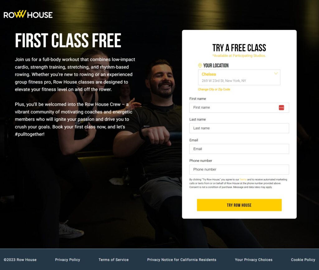
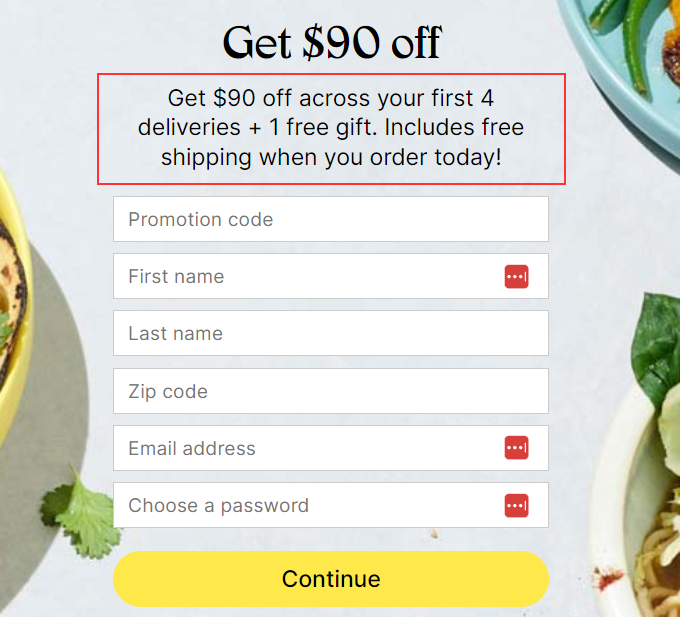
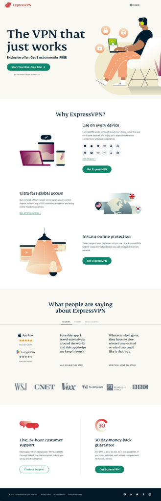
Here’s an example of a typical landing page:
Not all landing pages have the same format and not all of them necessarily have a form. There are different types of landing pages so you might see click-through landing pages that send traffic to another page (essentially a form) and they don’t have a form.
The common types of landing pages include:
- Lead capture landing page is the most used landing page that is used to generate leads via a form
- Squeeze page is a shorter form of a lead capture landing page used to collect necessary information without having a long copy
- Click-through landing page doesn’t have a form but rather a CTA which sends visitors to a conversion page (either a form or checkout page)
- Sales landing page is used to send visitors to a checkout page to generate sales. The landing page doesn’t collect any information rather it is used to sell or pre-sell a product and filter traffic
- Splash page is used in the form of a popup for announcements. It doesn’t necessarily have a lead capture form.
Essential Elements of a Landing Page
Irrespective of what type of landing page you are using, it should have a few basic elements (which makes it a marketing page). Here’s a basic layout of a high converting landing page with its key elements:
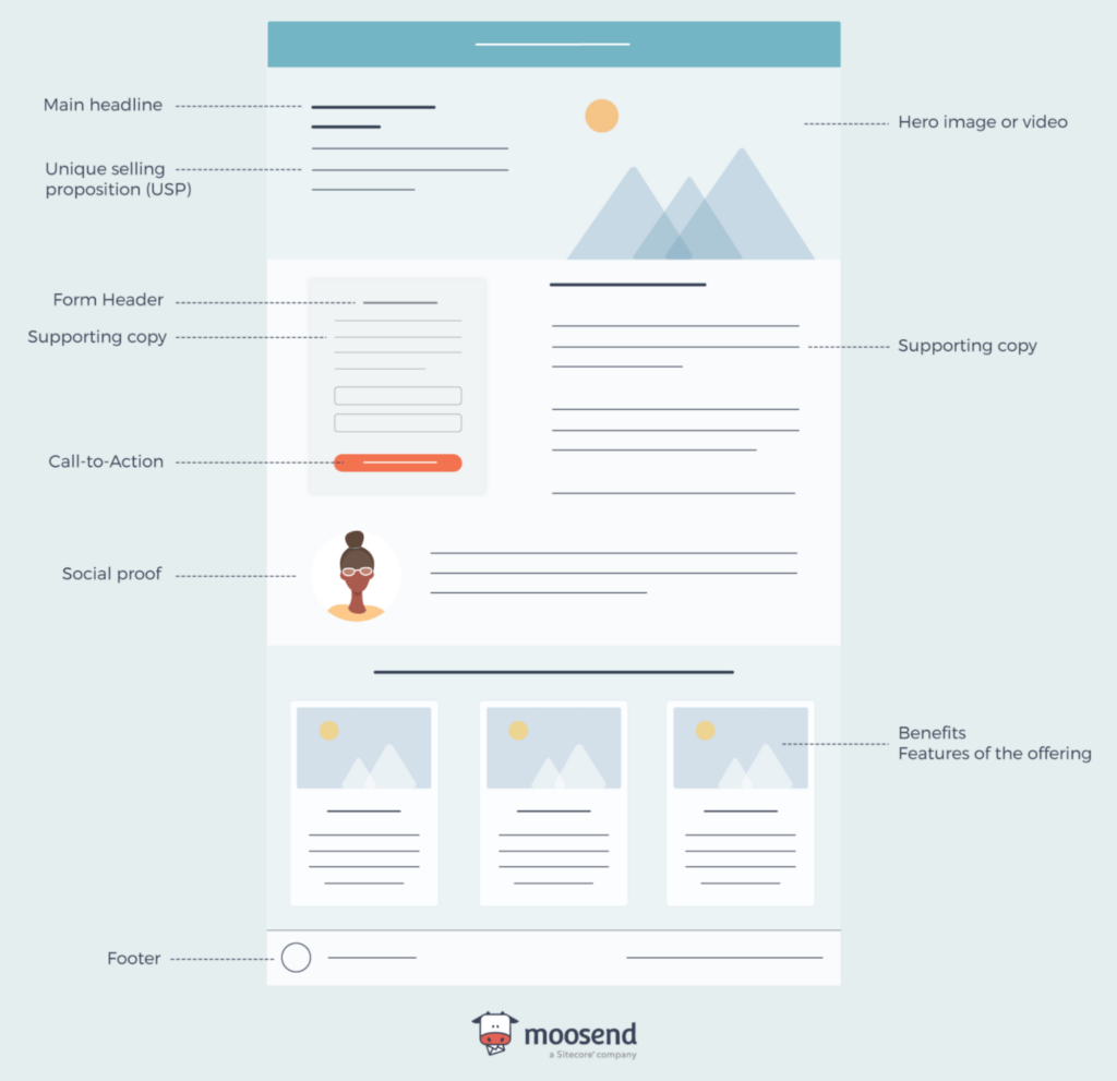
- Headline
- USP
- Image or video
- Form
- Copy
- Benefits
- Social proof
- Footer.
Let’s go through the essential elements of a high converting landing page to better understand how it should look:
1. Headline
Every landing page should have a main headline that describes the purpose of the page and is used to hook the visitors. It performs two primary roles:
- Communicates the value to the visitors and sets expectations
- Grabs attention and persuades visitors to keep reading.
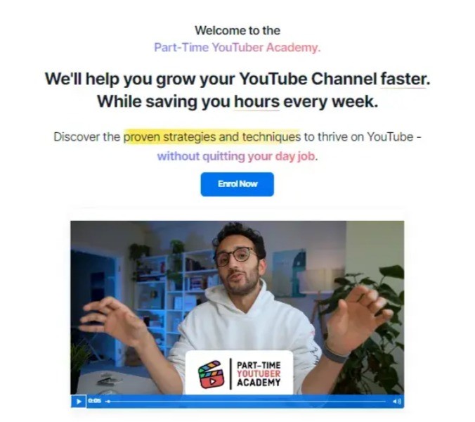
Here’s an example of a landing page headline that communicates value and grabs attention:
This headline increased the conversion rate of the landing page by a whopping 11.92% from 4.09%. This is because it grabs attention immediately and tells visitors why they should enter their email addresses.
Besides the main headline, you can use secondary headlines (optional) on your landing page including:
- Supporting headline which is the secondary headline
- Reinforcing headline that reminds readers of the main benefit multiple times with reinforcing statements. This is usually required on long-form landing pages
- Closing headline is usually used at the end of the (long) landing page that persuades readers to convert right now.
2. Unique Selling Proposition (USP)
Your unique selling proposition differentiates your offer from the competitors. It tells readers why they should opt in to grab the offer. This is the crux of your landing page as it directly addresses customer pain points and provides a solution.
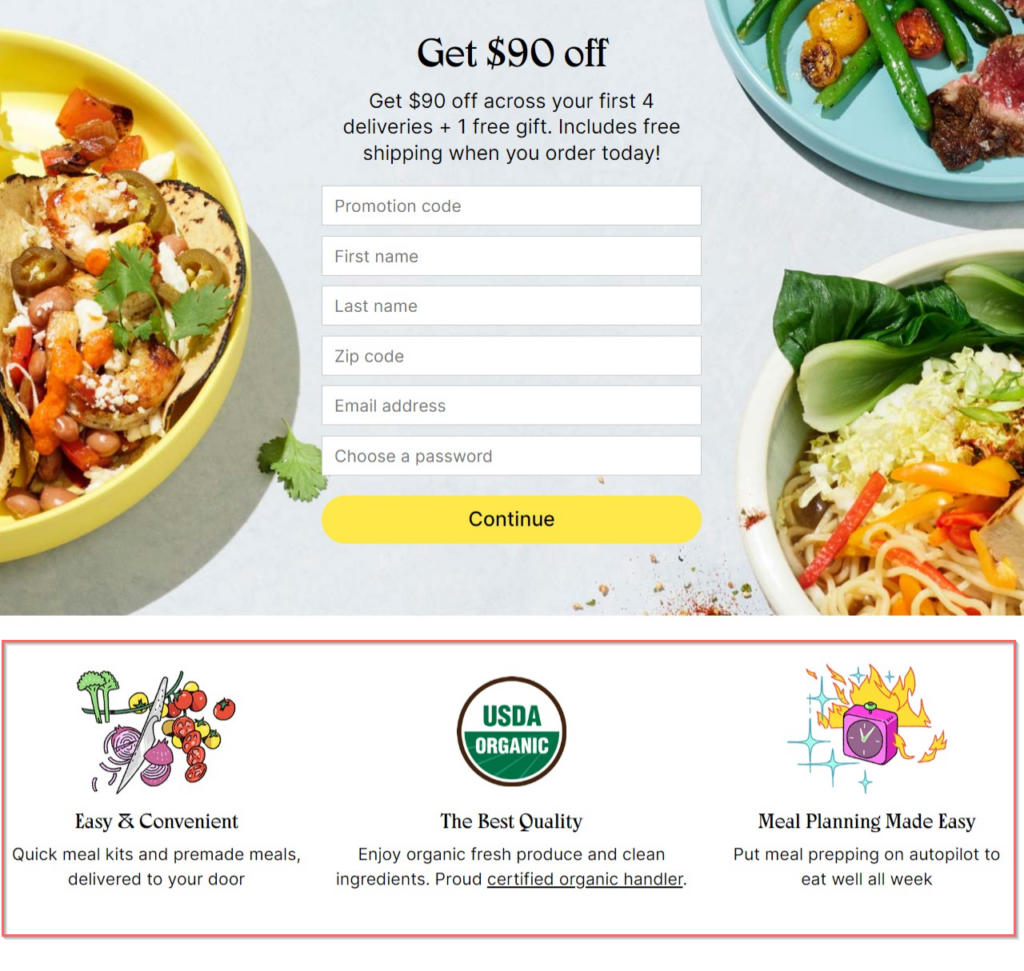
Here’s an example of USP on a landing page that sets the expectations:
Discount offer, free gift, and free shipping are the complete USP that makes Sun Basket stand out. The USP also sets the right expectations as to what people should expect after signing up for the offer.
3. Image or Video
Not all landing pages need an image or video, but most of them do. The visual element goes above the fold to grab attention and communicate the primary message visually.
People are used to seeing images and videos (due to social media primarily), and therefore, hate chunks of text. It has become a norm to add a supporting visual element on the landing page.
Here’s an example:
Here’s an example of a high converting landing page that doesn’t have any visual element and it looks equally appealing:
If you think an image or video will add value, you should consider adding one and see how it works.
4. Form
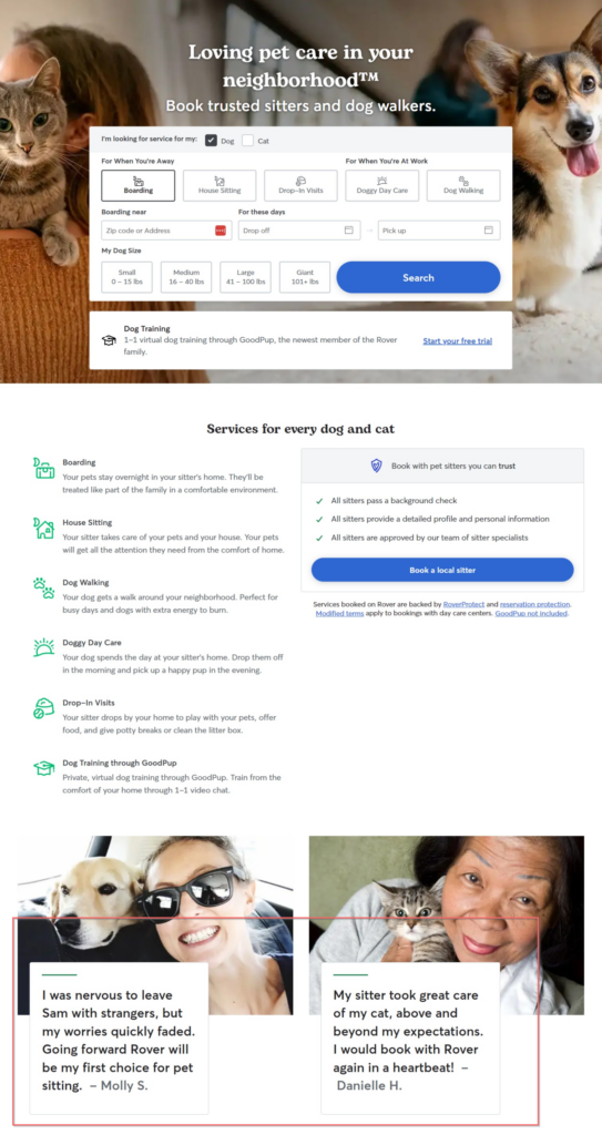
A signup form is the key element on a landing page. It includes a title, form fields, CTA, and additional details. When you don’t want to generate leads from the landing page, the form is replaced with a CTA that sends traffic to a relevant page.
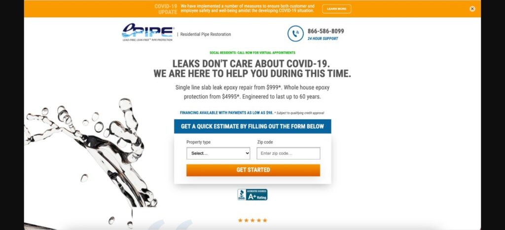
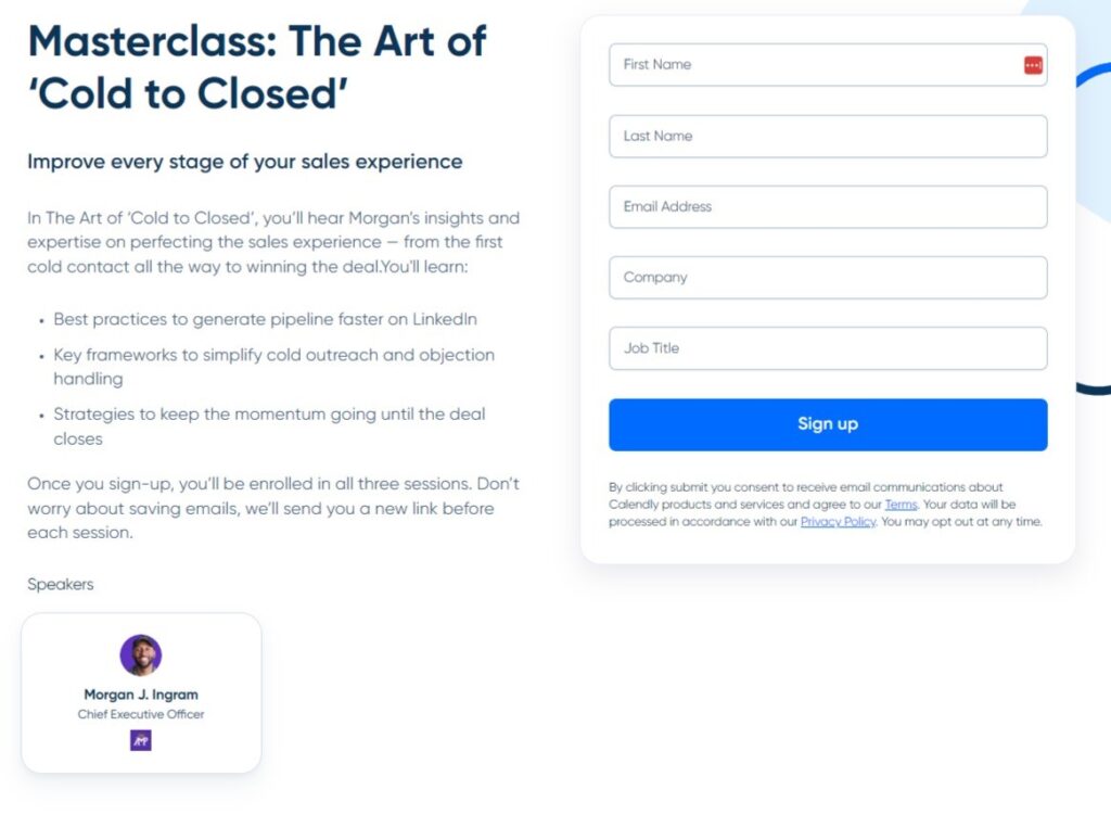
Here’s an example of a landing page form:
Depending on the purpose of your landing page, you can choose between short vs. long forms. The placement of the form on the landing page, the number of form fields, CTA, and everything else related to the form impacts the conversion rate of the landing page and UX.
Ideally, the form should have minimal fields. It should be placed above the fold. The CTA must be prominent. For best results, you need to optimize the form by running A/B tests.
5. Benefits
A unique selling proposition gives a glimpse of the main offer but doesn’t go into detail. The landing page should have a list of the major benefits of the offer.
Sub Basket added the form above the fold and then immediately listed the benefits of the offer right below the form:
Again, these benefits aren’t necessary and not all landing pages require these. For instance, if you have a squeeze page, you don’t need to add benefits as it’ll be a short, scroll-less landing page.
But if you need a high converting landing page, you should add benefits.
6. Copy
The landing page copy covers the nitty-gritty. Most landing pages don’t need a lot of copy as they are short-form. If you are creating a long-form landing page (e.g., a sales landing page to pre-sell a product), that’s where you’ll need a copy.
It has to be short, crisp, and highly persuasive.
The purpose of using extensive copy on the landing page should be to provide detailed and unique information to the readers.
Here’s an example of landing page copy done right:
There is only one headline and the rest is plain text but it’s exceptionally well-written and explains the reason why readers should sign up.
For long-form landing pages, the copy is the best place to add keywords to improve search visibility. Normally, landing pages don’t rank well in search engines, but if you have a long-form landing page that has optimized copy, it can make it to the SERPs.
7. Social Proof
Social proof is a highly effective way to boost conversions as people tend to copy the actions of others. It is a psychological phenomenon that’s extensively used in marketing. When you offer a lead magnet or pre-sell a product on the landing page, that’s where you can use reviews and testimonials to boost the credibility and trustworthiness of your offer.
Here’s an example of social proof in action on a landing page:
If social proof fits in, add it. Studies show that up to 92% of consumers trust reviews and social proof increases sales by 18% and conversion rate by a whopping 270%.
It is a must-have part of a high converting landing page.
8. Footer
The footer is where you can add links to terms, policies, refunds, etc. It should have links to your privacy policy page and how you collect and use customer information. This is, in most cases, mandatory since you are collecting user information, and readers want to know how their personal information is treated.
The design of a landing page must be inherited from the site if it is part of your site (and isn’t a standalone page). In this case, it should have menus. For instance, webinar landing pages or lead magnets are often part of your site and follow the same design. Here’s an example:
Here’s an example of a standalone landing page that has a footer but doesn’t inherit its design from the site:
The footer has a privacy policy, terms of service, cookie preferences, and social links. These pages make your landing page compliant. If you are linking a landing page from Google Ads or any other ad network, they’d require you to add links to privacy policy and other legal pages (depending on your target location).
How to Create a High Converting Landing Page
Now that you know the basic parts and structure of a landing page, let’s find out how to nail landing page creation. Here’s a step-by-step guide on how to create a high converting landing page for any business:
Step #1: Define Goal
Landing pages have different types and each type has its specific purpose so it’s essential to identify your goal of creating a landing page. This will help you choose the right landing page type that works best to meet your goal.
The primary question you need to answer is: Why are you creating a landing page?
It’ll lead you to the purpose of the page.
For instance, if you need a landing page for an ad campaign to generate leads, the purpose of the landing page should be to generate leads and you’ll know what type of landing page you have to use.
Don’t confuse this ‘goal’ with your marketing objective, campaign goal, or any other goal. This goal defines the reason why you need a landing page.
Clearly defining the purpose of landing page creation helps you in two major ways:
- You can identify the right landing page type and design
- It improves the conversion rate.
A well-defined, singular goal per landing page ensures that the page is highly focused. The copy, form, CTA, and other elements on the page will have a single purpose which significantly reduces distraction leading to better UX and a higher conversion rate.
Step #2: Choose the Correct Landing Page Type
Selecting the right landing page type is important for multiple reasons. The automated workflow for landing pages works differently.
For example, a click-through landing page has a simple link that sends traffic to another page while a squeeze page has a form that’s linked to your email marketing app. The subscribers receive automated emails and move to the correct segment based on preferences.
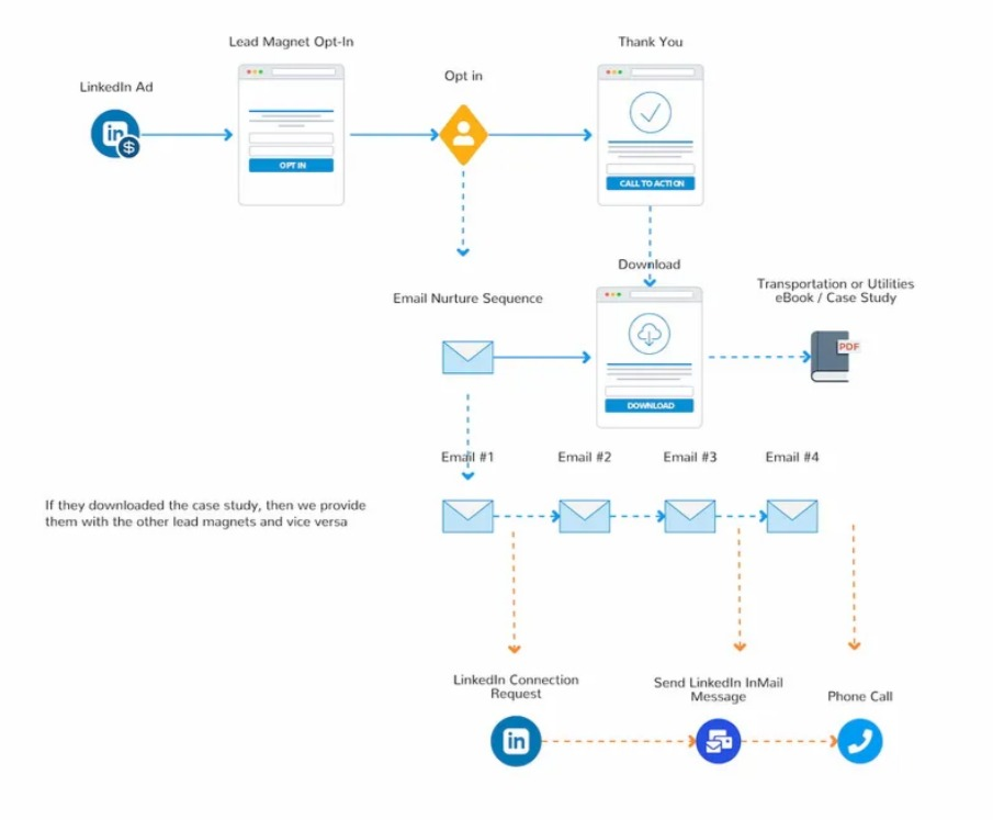
Here’s the backend flow of a lead capture landing page:
Secondly, most landing page builders have customizable templates. Knowing what type of landing page, you’ll save you a lot of time as you can choose the right template, customize it, and hit publish.
Once we were working on a landing page and the designer picked a nice template from the landing page platform, spent 3 days on its customization for multiple devices, and sent numerous messages and emails to the client during the design process.
After spending more than 3 days on the design, we realized that the template didn’t support a long-form landing page (which was our requirement) and we had to choose a new template and repeat the process.
You can avoid such issues when you know the exact type of landing page you need and your requirements.
If you have defined the purpose of landing page creation (in Step #1 above), choosing the right landing page type will get easier.
Step #3: Choose the Right Landing Page Builder
The landing page builder we had wasn’t too flexible. In most cases, you can copy elements from one landing page to another through the landing page builder that’s offered by all the leading platforms.
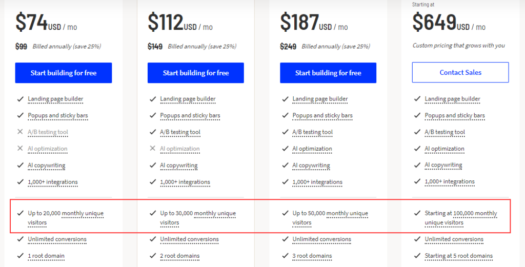
Unfortunately, most marketers and businesses prefer price over features and flexibility. This is because landing page platforms have subscription-based pricing which is usually linked with monthly traffic. If you drive more traffic, you’ll have to pay more and vice versa.
Here’s an example from Unbounce:
Consequently, most businesses opt for low-end landing page builders that have a single lifetime fee without any restrictions. This sounds like a great deal, but there’s a catch.
These landing page tools aren’t flexible and lack basic features like integration, support, scalability, and regular updates.
Look beyond price and consider other features and perks such as:
- Drag-and-drop landing page builder
- Templates
- Customization options
- Integration
- Traffic limit and domains
- Customer support
- Scalability
- Plugin availability for your CMS
- Ease of use and learning curve.
Here’s the thing: The landing page tool plays a pivotal role in marketing. It works with your website, email marketing tool, CRM, sales tool, and other marketing apps. It can’t work alone which means you need to ensure that it has exceptional integration options and it is scalable.
Scalability refers to the platform’s ability to meet your business’s growing needs. If it offers customized and enterprise plans, it’s a good choice.
Why?
Because your business will grow eventually the landing page tool should be able to cater to your needs after a few years. Otherwise, switching to another tool after working with an app for years gets quite challenging.
Here’s a list of the top landing page builders:
- Leadpages supports unlimited traffic with a starting price of $49 per month
- Unbounce is a feature-rich landing page tool with a starting price of $99 per month
- ConvertKit has a built-in email marketing tool and it has a free plan making it ideal for small businesses on a budget
- Instapage offers a wide range of features and is fully scalable. The starting price is $99 per month
- Landingi offers an all-in-one solution that includes popups and funnels with ecommerce support. It has a starting price of $29 per month.
Step #4: Match Intent with Offer
One of the key elements of a high converting landing page is that its offer, search intent, copy, and ad are aligned perfectly.
You can drive traffic to a landing page in two ways (broadly):
- Organic
- Paid.
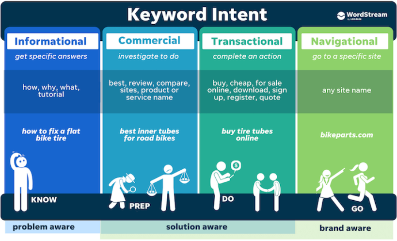
For organic traffic, the search intent should match the offer. If your landing page is ranking for an informational keyword, the offer on the landing page should be an information product such as a PDF.
Here’s an example of search intent types:
For paid traffic, the ad should match the offer. If your ad promises a free product, the landing page should offer the same product free of cost. Doing otherwise will lead to poor UX and reduce the conversion rate significantly.
Here’s an example of how misalignment between ad copy and landing page offer reduces conversion rate:
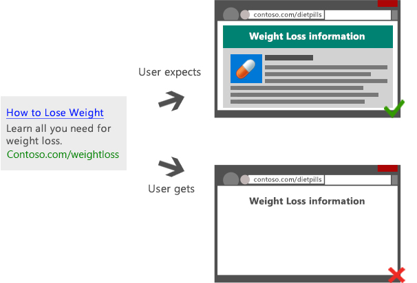
Once the user is on the landing page (either through a paid or organic source), the headline, offer, copy, form, CTA, and everything else should be aligned and must match what’s promised in the traffic source. This is a reason why you should stick with one offer per landing page as it gets easier to keep users hooked leading to a higher conversion rate.
Step #5: Improve On-Page SEO
Optimizing your landing page for search is important even if you don’t want to drive organic traffic. SEO improves UX and makes it compliant, accessible, and user-friendly. On-page SEO isn’t all about search visibility rather it focuses on improving UX.
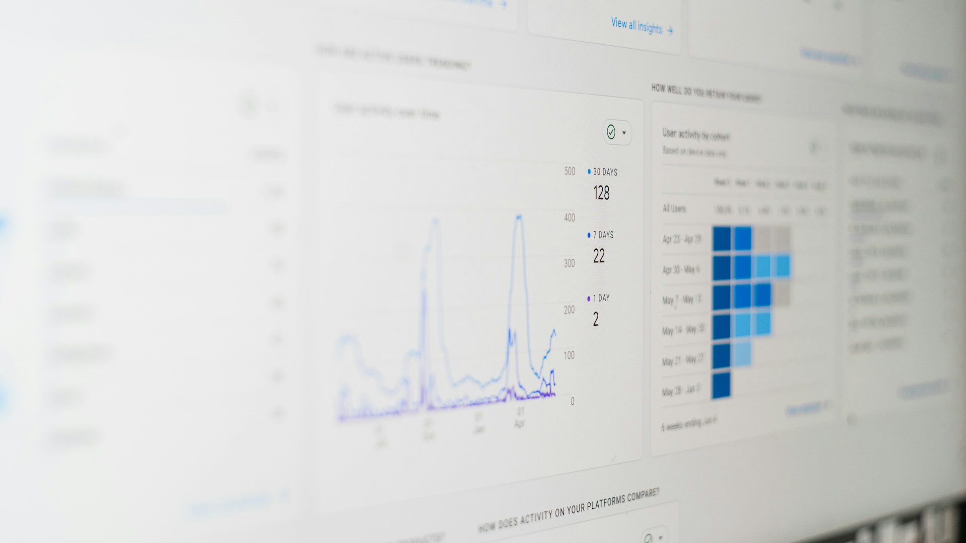
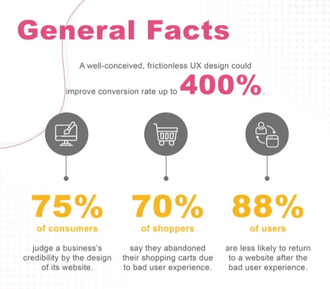
Research shows that offering superior UX to visitors can increase conversion rate by a whopping 400% and 70% of people leave a website due to poor UX:
On-page SEO also improves your landing page’s crawlability and indexing. With spot-on optimization, search engine crawlers will be able to better find, index, and rank your landing page. If crawlers can’t make sense of your landing page, it’ll get very tough to rank it anywhere in SERPs.
Even if you aren’t trying to drive organic traffic, on-page SEO is still essential because search crawlers need to know what’s on the page and they can only understand it if it’s optimized.
Here’s a list of the best ways to improve the on-page SEO of your landing page for better performance:
- Improve Core Web Vitals by monitoring your landing page via PageSpeed Insights. Follow the recommendations to improve the page experience for users
- Host your landing page on your domain to boost security and trust. Landing page tools allow users to host landing pages on their server and domain which is an easy and non-technical approach, but it should be avoided. Connect your domain with the page builder and host landing pages yourself
- If you want to drive organic traffic to landing pages, add internal links to them. Link from internal money pages and menus
- Add helpful content to avoid thin content. If you have a squeeze page or other short-form landing pages with minimal content, it’s best to no-index them to avoid thin content across multiple URLs. Only index landing pages that have high quality long-form content
- Add alt text to images and other HTML tags
- Minimize CSS and JavaScript usage and minify wherever possible to improve CWV
- Add a link to your home page and a footer menu to allow users and search crawlers to navigate to other parts of your site
- Use friendly and descriptive URL
- Distribute content into different sections and use proper formatting. Add headings, subheadings, bullets, lists, and lots of white space.
Refer to this guide for more details on SEO best practices.
Step #6: Test and Tweak
Landing page creation is a continuous process that requires numerous tweaks and iterations. You need to run A/B tests to inspect different elements and see what works best.
If you want to increase the conversion rate of your landing pages, you need to conduct experiments. That’s how you remove elements that hinder conversions and replace them with elements that support conversions.
You have to do it scientifically, not based on your intuition.
This means you can’t replace the image on the landing page just because you think it doesn’t look good. You can only change it if data shows that people don’t like it.
Behavioral tools work best in analyzing how visitors interact with different elements of a landing page. Tools like heatmap and scroll maps provide you insights at a granular level.
Conclusion
The 6-step guide for creating a high converting landing page will help you create a series of landing pages for marketing campaigns.
You need to stick with Step #6 once you have a few decent converting landing pages in your portfolio. That is, use data to tweak them by running A/B tests to improve their conversion rates.
If you’ll continue creating new landing pages, it’ll get too complicated. You’ll eventually have a lot of landing pages (including abandoned ones), and all of them have average conversion rates. Nothing exceptional.
Experimentation is what’s essential for success with landing pages.
Don’t undermine it.
Featured Image: Unsplash