Are you getting enough traffic to your website?
Is traffic converting well?
Website traffic becomes useless if you have a poor conversion rate. When you increase the conversion rate of your website, even a few hundred visitors per month seems like a lot.
It’s time you should switch your focus from traffic generation to conversion optimization.
These advanced conversion rate techniques are a continuation of 10 conversion rate optimization tactics published earlier. Since I have already covered the basic conversion rate techniques, I’m covering advanced techniques in this post.
1. Collect and Analyze Data
Increasing the conversion rate of your website gets easier when you have access to the right data. The best way to improve conversions is by making data-driven decisions instead of your judgment.
For example, data will tell you what pages to prioritize for optimization and how visitors interact with a specific page. You can use heatmap to see visitor interaction with a page which helps you decide what elements to tweak for higher conversions.
Collecting and analyzing website data is an essential part of conversion rate optimization. You can collect data in multiple ways:
- Use analytics tools to collect visitor data (e.g., Google Analytics)
- Behavioral tools like heatmaps
- Competitor analysis
- Primary data collection through website surveys.
For instance, you identify low conversion pages on your site via Google Analytics. You look at session recordings and heatmaps to understand how visitors spend time on these specific pages. You identify image and copy as the main culprits. Then, you add a short survey on these pages asking visitors: What made them leave your site? You can add different elements and convert your survey into an MCQ or you can ask visitors to rate a specific element on the page such as navigation, copy, headline, image, etc.:
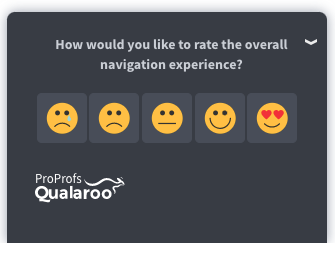
Analyzing survey responses will help you find the element that’s acting as friction.
That’s how data helps you improve the conversion rate of your website.
The best thing about data collection is that it takes guesswork out of the equation which significantly reduces time and resources.
Once you have the data, you can add it to the relevant buyer persona to improve targeting and conversions across marketing channels.
Data will never disappoint you.
2. Remove Distractions
Distraction on a website refers to any element that acts as a barrier and prevents visitors from focusing on what they want to do on your site. Popups and ads are common forms of distractions that deviate a visitor’s attention.
If you want to increase the conversion rate of your website, you need to help visitors take action and convert. Everything on the web page should direct the visitor’s attention towards the conversion action.
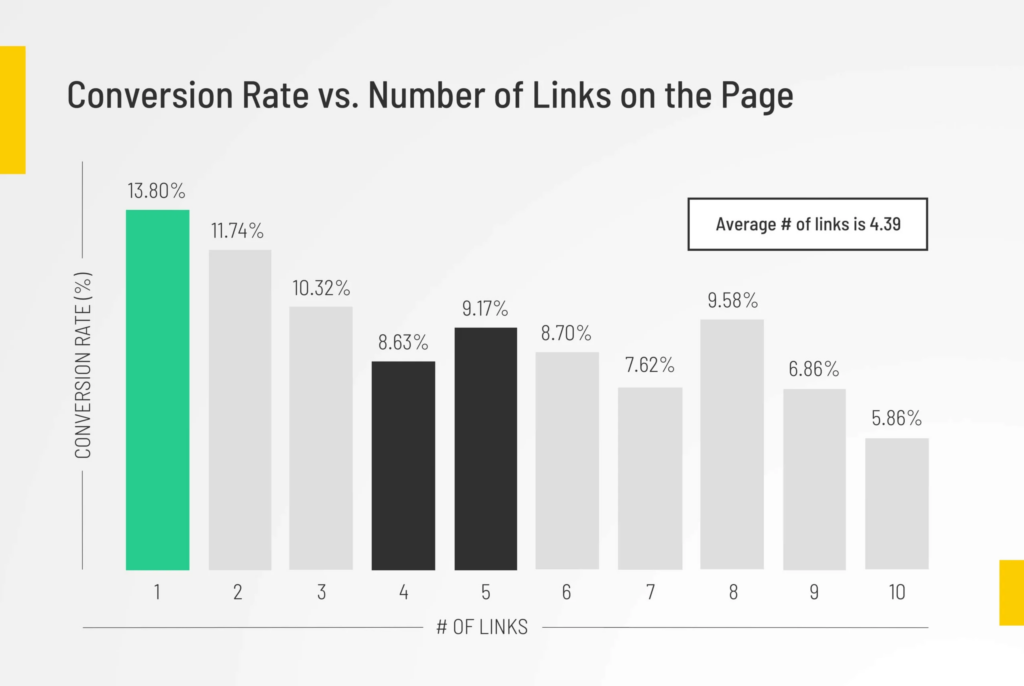
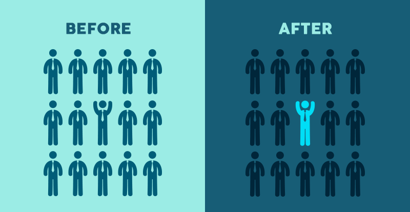
An analysis of 20K landing pages found that landing pages with a single link have the highest conversion rate and as the number of links increases, the conversion rate decreases. More links create distractions while a single link helps visitors maintain their focus:
Identifying distractions is the hardest part. You need to use a heatmap tool and check session recordings to understand how visitors interact with your site, where they spend the most time, and what elements on your site keep them hooked.
Analytics tools won’t tell you much about distractions. Behavioral tools help you get a better insight.
Here’s a list of best practices to follow to minimize and remove distractions on your website:
- Improve UX. Most distractions originate from poor user experience
- Get rid of unnecessary elements on the landing page
- Follow Rule of One which focuses on having a clear singular purpose with a single CTA on every page throughout your website
- Simplify website design and follow a minimalistic approach. This helps users focus on the right places
- Reduce options. Stick with one CTA per page rule and make sure you don’t give more than a single option/offer to visitors on a page
- Keep layout and structure simple. Make sure that visitors don’t have to think before they take action. Everything should be crystal clear
- Use images, videos, and illustrations to grab attention and improve comprehension
- Use consistent font and color scheme
- Avoid animations, blinking text, busy backgrounds, multiple fonts and colors, and background music. All these elements create a distraction as they are unnecessary and play no role in conversions.
3. Highlight Value Proposition
The value proposition is a statement that tells potential customers what makes your offer different from competitors and why they should buy from you. Having a clear value proposition on your website makes it easy for visitors to make a decision – leading to a high conversion rate.
Visitors don’t have the time to think and compare your offer with the competitors. This rarely happens. If they can’t figure out the actual benefit they’ll derive from your product, they’ll move on.
It’s your responsibility to highlight the benefits of your product and make it easy for visitors to understand what makes you better and why they should act now.
Here’s an example of a value proposition by Zapier. It clearly highlights what their app does and how it can benefit its users:

Value proposition plays a key role in conversion rate. It removes distractions and helps your target audience understand the value your product provides them with. This significantly improves UX and leads to a high conversion rate.
The value proposition on your website should have the following elements:
- Target audience: Who is the product for
- Product: What’s your primary product
- Benefits: What benefits the product offers
- Different: How your product is different from the competition.
Follow these guidelines to write a perfect value proposition statement for your website to boost conversion rate:
- Understand your target audience and their primary problem/challenge. Use buyer personas to identify key challenges of your target audience
- Have a clear understanding of your competitors and their offers
- Identify a list of factors that differentiate your product and business from competitors and highlight the same in value proposition
- Your value proposition should be a short statement that directly talks to your target audience
- Keep it clear, concise, and accurate
- Set the right expectations. Only mention the benefits that your product actually offers
- Keep value proposition hype-free.
4. Optimize Site Structure and Layout
Website structure is the process of how your site’s pages are connected to each other while the layout refers to the arrangement of different elements on a web page.
Optimization of both structure and layout is essential for conversion rate.
Website structure helps visitors navigate your site. A well-structured website has connected pages making it easier for visitors to jump from one destination to another. Visitors don’t feel lost and can always find their way.
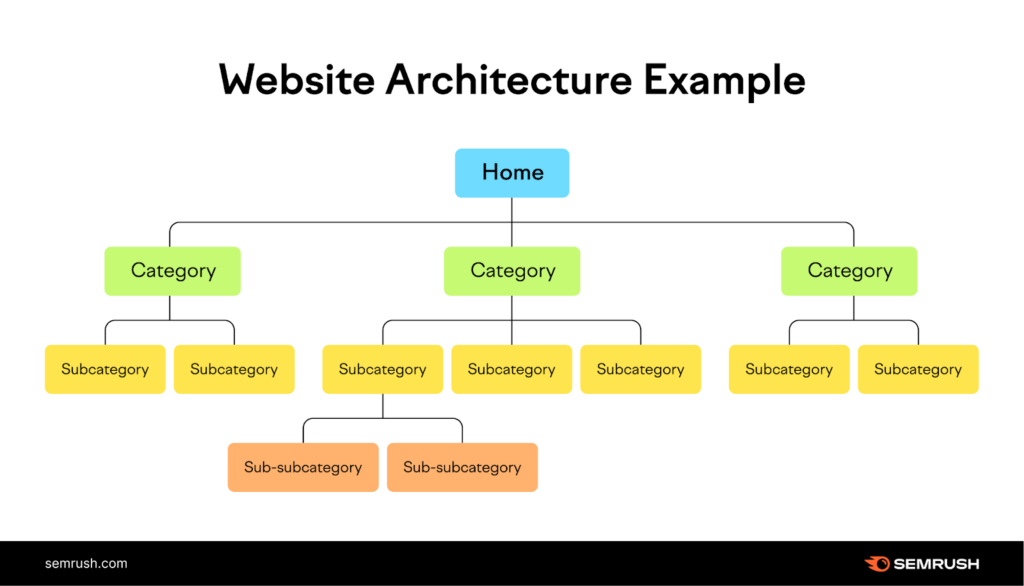
Here’s an example of how website structure improves navigation and UX leading to a high conversion rate with minimal drop-offs:
Site structure only tackles how pages are connected but it doesn’t handle what you have on your pages. That’s handled by layout. The layout of a webpage determines how visually pleasing, easy-to-use, and user-friendly layout you have and these factors directly impact conversion rate.
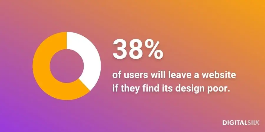
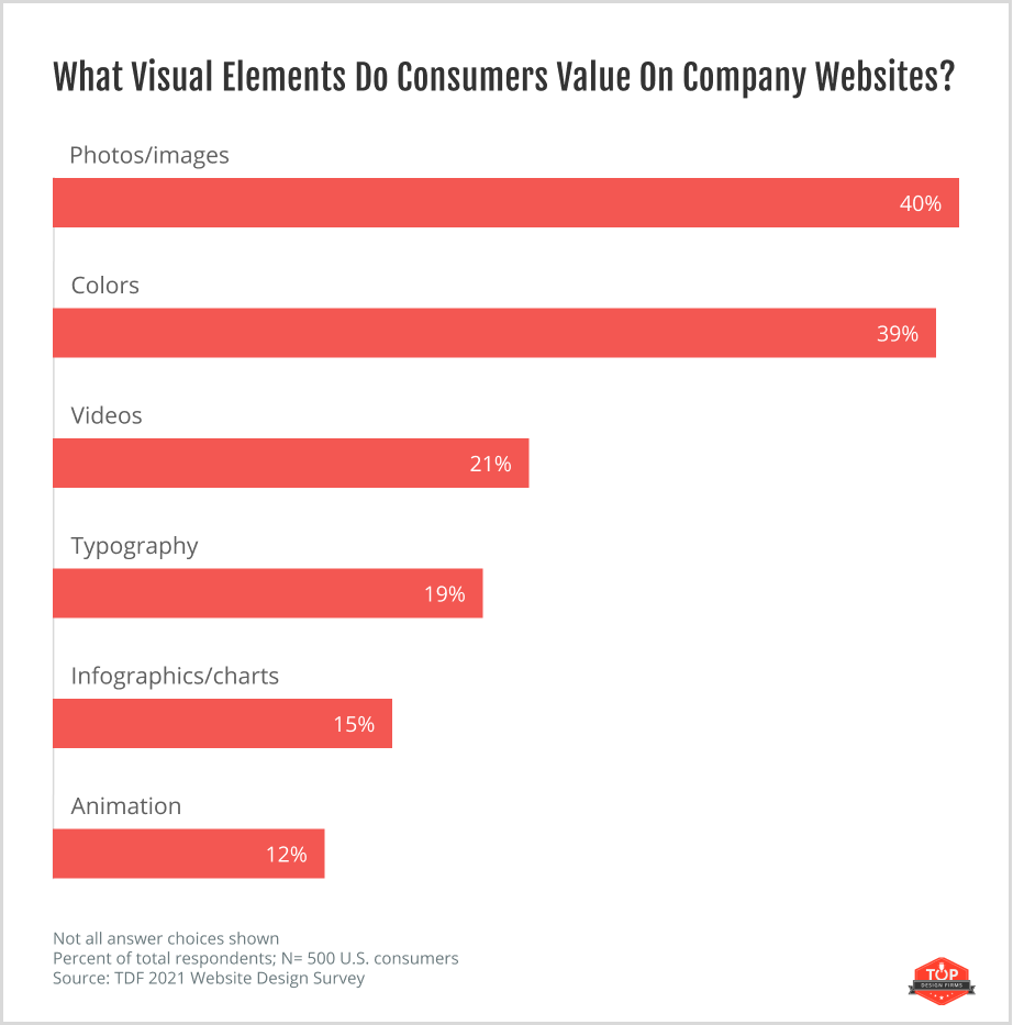
A study reported that 38% of people say they focus on the layout and navigation of a website on their first visit and 59% of people say that they are more likely to spend more time on well-designed sites:
Research shows that people tend to value photos and images the most on a website followed by color scheme while only 21% reported that they value videos and other visual elements:
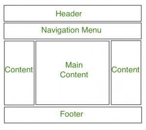
Your site’s layout covers the structure of individual pages and how all the elements are arranged at the page level. Here’s an example of a site layout for a single page:
There are different layout types you can choose from:
- Single column layout
- Split screen
- Modular grid
- Zigzag
- Fullscreen
- Asymmetrical
- Magazine
- F-pattern
- Card layout.
You need to figure out what layout works best for your audience. There’s no single best website layout to increase conversion rate. The idea is to test different layouts, choose one, and then tweak it consistently to optimize it.
Follow these general guidelines to improve site layout for higher conversions:
- Keep it simple
- Add white space
- Focus on navigation and UX instead of design
- Keep it consistent across your website
- Make your layout responsive and accessible.
5. Use Visual Hierarchy
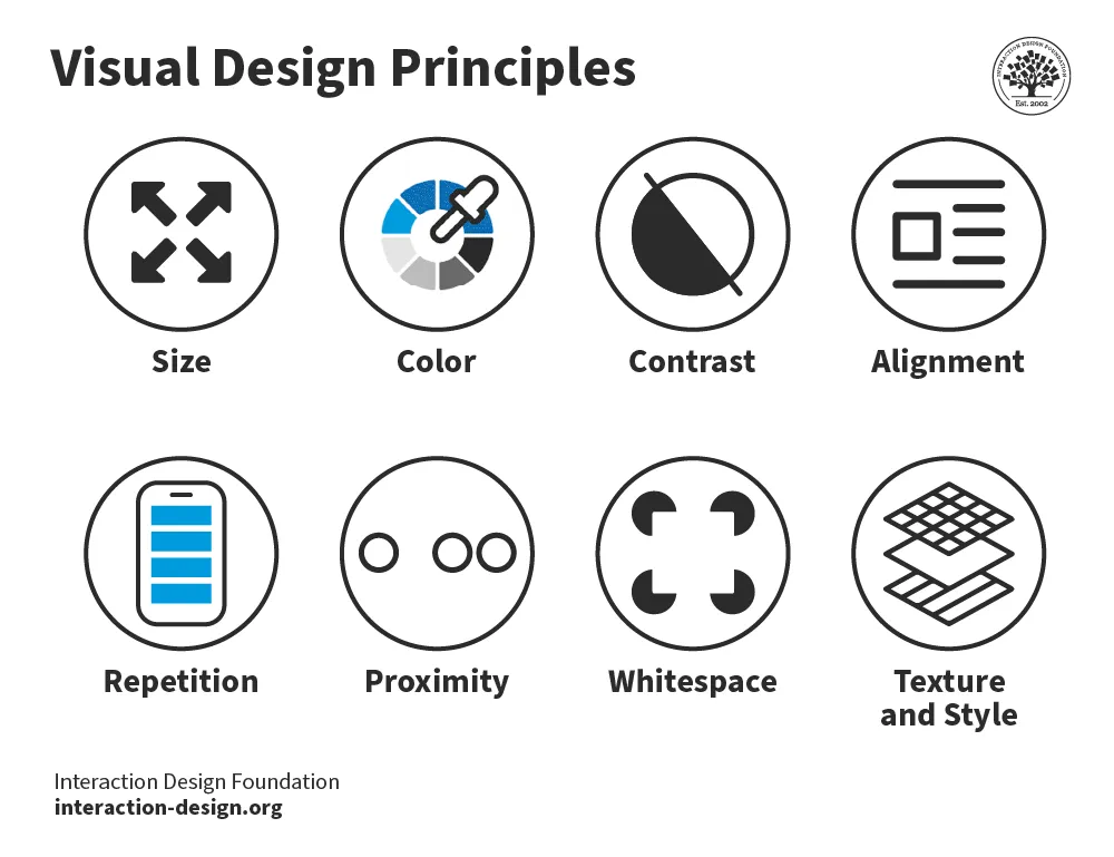
Site layout isn’t enough to boost conversion rate. You need to use a visual hierarchy to guide visitors to the most important elements on your page. It is a design principle used to arrange elements on a page logically to boost conversions.
The common principles used in developing visual hierarchy include size, color, contrast, alignment, repetition, proximity, white space, and texture:
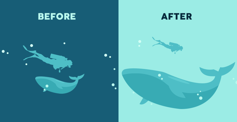
Here’s an example of how size is used to direct visual attention:
Here’s an example of how color is used to draw attention to a specific element on a webpage:
You can use visual hierarchy in web design to improve conversion rate. Here’s an example by Google where it uses a lot of white space to maintain user focus on the key elements on the page:

This helps you direct visitors to the CTA to increase the conversion rate of your website. Instead of visitors looking for what action they have to take on your site, let the design guide them visually and they’ll know what they have to do.
Follow these best practices to leverage visual hierarchy to increase the conversion rate of your website:
- Understand reading patterns and shape them with Z and F patterns
- Bigger items and fonts get more attention and grab attention instantly. Use size to highlight major elements on your website
- Contrast catches eyes
- Use white space to arrange elements logically and drive attention.
6. Use Video
Video content works best in terms of increasing engagement and conversion rate.
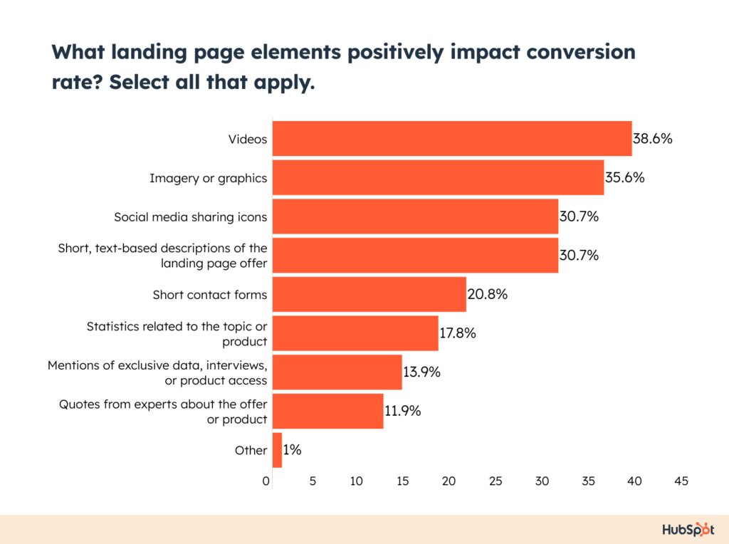
A study reported that video is the number one element on a landing page that boosts conversion rate as reported by 39% of marketers:
As much as 30% of the top landing pages have at least one video on them. Video on a landing page, on average, increases conversion rate by 86%, engagement by 60%, leads by 18%, sales by 14%. Interactive video content is even better than conventional video as 43% of consumers prefer it over other types of video content:

If you plan to use video to increase the conversion rate of your website, you need high quality, professional video content. This costs a lot of money (usually much more than text).
And when you switch to interactive video content, it has an even higher cost.
But it all pays off at the end of the day.
Follow these best practices to incorporate video content to increase the conversion rate of your website:
- Stick with professional, studio-level videos. It’s better to create one quality video per month than creating multiple low quality, phone recorded videos per week
- Add video to key pages on your website such as the home page and landing pages
- Choose the right video type for your site. Explainer and testimonial videos work best for all types of businesses
- Embed CTA within the video. Since the purpose of the video is to boost conversion rate, it should tell visitors what action they have to take after watching it
- Keep your video short and accurate.
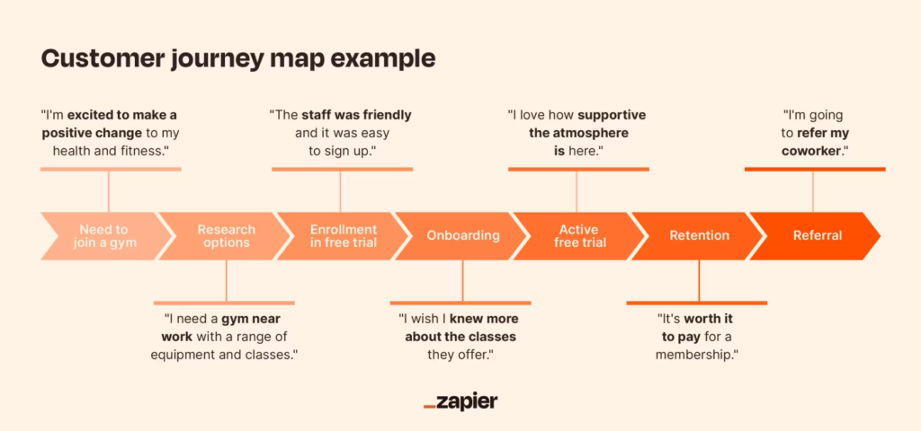
7. Simplify User Journey
The journey a customer takes to become your customer needs to be simplified and optimized. Customer or user journey refers to the series of steps a user takes to achieve a goal.
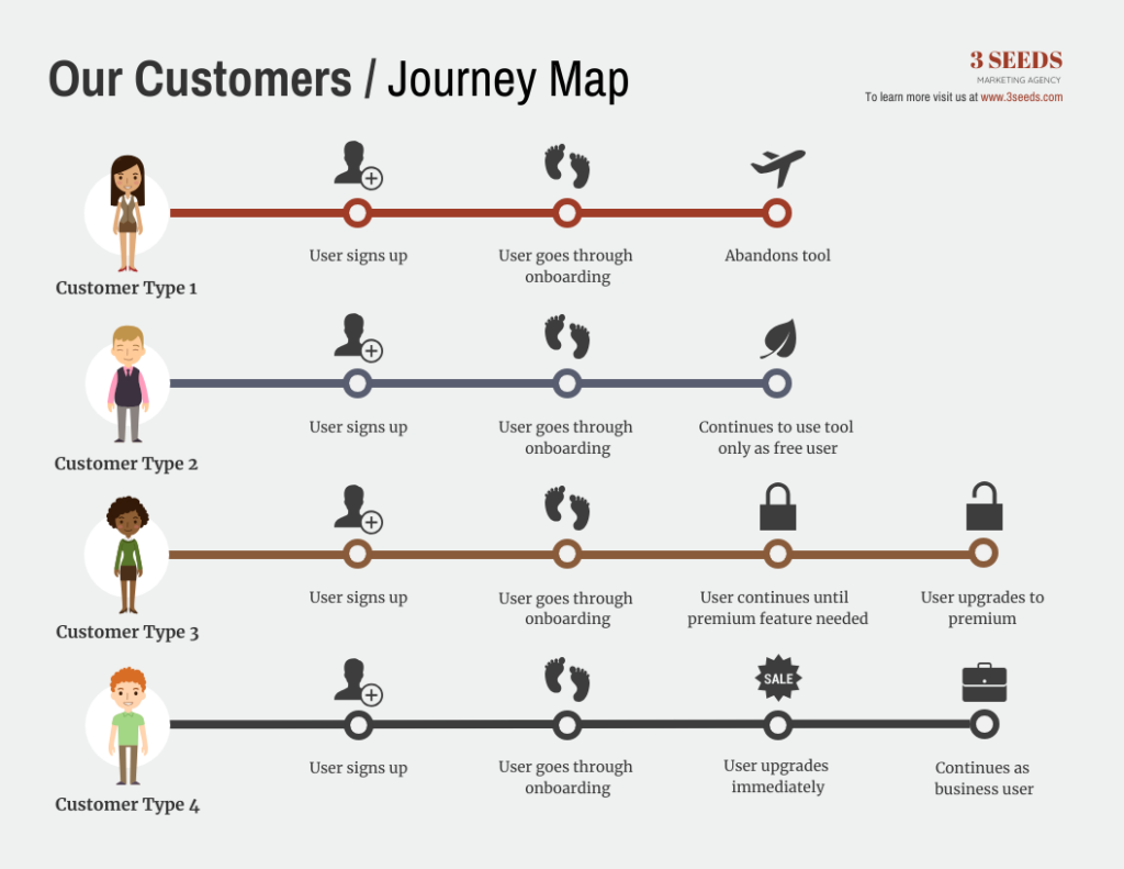
Here’s an example of how user journeys of different customers for the same product:
A potential customer takes multiple actions before the final macro conversion. The small actions are known as micro conversions that eventually lead to the main conversion (known as macro conversion) which is usually a sale.
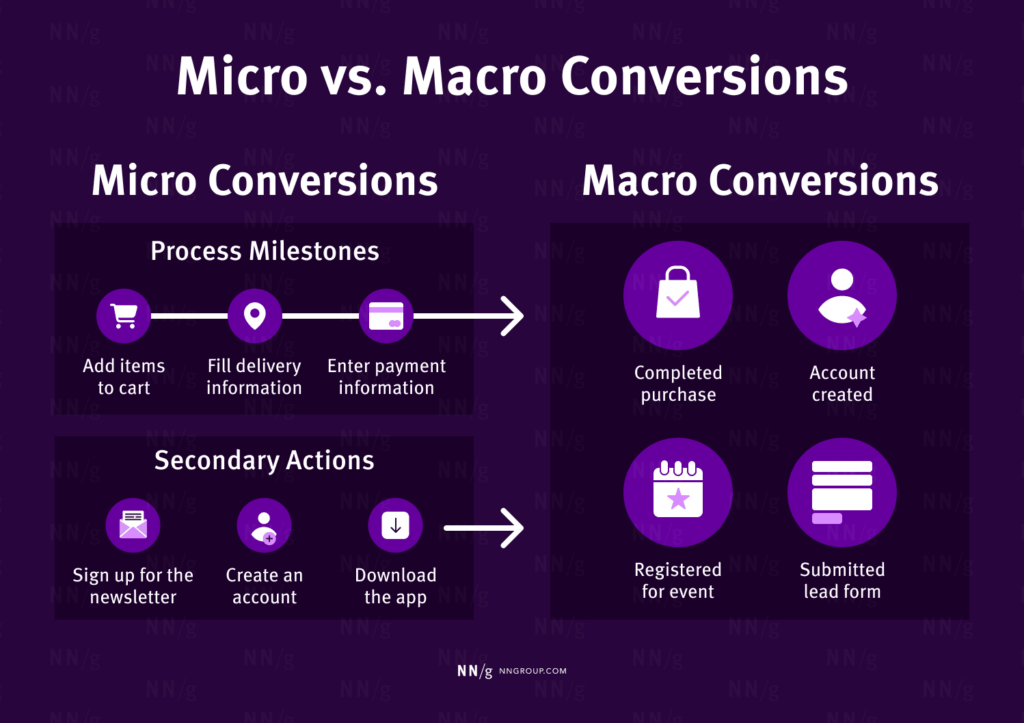
The user journey consists of multiple micro conversions and one (or more) macro conversion. You need to ensure that the entire journey end-to-end is fully optimized. The simpler micro conversions are, the better.
You need to identify the user journey, define the journey map, and optimize it to improve both micro and macro conversions.
- Identifying user journey requires the use of data and analytics tools to understand how potential customers interact with your website and what steps they take to become a customer
- The journey map is derived from the actual user journey and is the visual representation of the end-to-end journey that customers take. This is an internal document that helps you and your team identify all the steps in the user journey
- Optimize and simplify each step in the journey based on the customer journey map. This calls for removing unnecessary steps and stages, merging steps, and optimizing all the phases in the journey.
Your goal should be to simplify the user journey by making it easier and quicker for potential customers to reach the macro conversion. Optimizing the journey isn’t enough, you need to work on its simplification which involves the following steps:
- Identify high value and low value touchpoints in the customer journey map
- Remove low value interactions that have minimal impact on the final conversion
- Break down or simplify high value touchpoints to simplify your ideal customer’s journey.
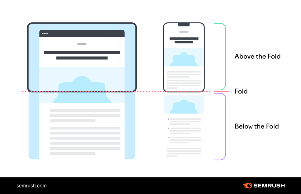
8. Utilize Above the Fold Area
The part of a website or webpage that’s visible to the visitors without scrolling is known as above the fold. This area holds significant importance for conversions for the following reasons:
- 57% of a website’s viewing time is spent above the fold
- Website visitors spend 17% time on the second screen they see after scroll
- The first two screens collectively receive 74% of the total time spent on a website with the first screen getting the highest share
- 81% of people spend the most time looking at the first paragraph.
More than half of the website visitors never scroll and leave your site without moving to the second screen.
This means you have to make above the fold area the best part of any web page. It should be persuasive and catchy and it should be strong enough to grab attention and hook visitors.
Importantly, you should place your primary CTA above the fold. This is crucial for increasing the conversion rate of your website as this will help you convert visitors who don’t scroll.
If your CTA, benefits, and crux of the page are placed at the bottom of the page, you’ll struggle to have a decent conversion rate. No matter how great your landing page and copy are, only a small percentage (less than 25%) of visitors will scroll and move toward the end of the page.
Here’s how you can utilize above the fold of your website to boost conversion rate:
- The headline and subheading should talk to the visitors and must highlight your unique selling proposition
- Move benefits and CTA above the fold
- Avoid getting into too much detail rather highlight one big benefit of your offer and add an explanation below the fold
- Use at least one image above the fold as images perform much better than text and they convey your message comprehensively
- Remove distractions and add ample white space
- Optimize above the fold for mobile devices.
9. Add Incentives
You can increase the conversion rate of your website by offering highly valuable incentives to your target audience. An incentive is anything that you give away free of cost to your target audience to persuade them to convert.
Incentives include anything that’s of value and is offered free such as free shipping, free trial, PDF, whitepaper, discount code, etc.
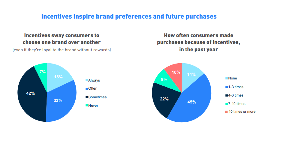
A study reported that 75% of people are more likely to buy from a brand that offers them incentives, 45% of consumers made 1-3 purchases in the past year purely based on incentives, and 18% of consumers that they’ll buy from another brand if it offers incentives even if they are loyal to another brand:
Incentives work best for macro conversions such as a sale or submitting a lead form. For instance, you can offer free shipping to potential customers who leave your site without buying. Or, you can use an exit-intent popup to pitch a highly valuable incentive.
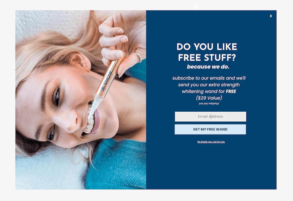
Here’s an example of how to use incentives to increase the conversion rate of your website:
Follow these best practices to use incentives to drive more conversions:
- Identify the right incentives for your buyer personas. The incentive should be highly specific and relevant to the audience’s needs
- It should be perceived as highly valuable by your audience or persona
- Use personalized incentives
- Avoid overdoing it as it will negatively impact the conversion rate as your ideal customers stop converting without incentives.
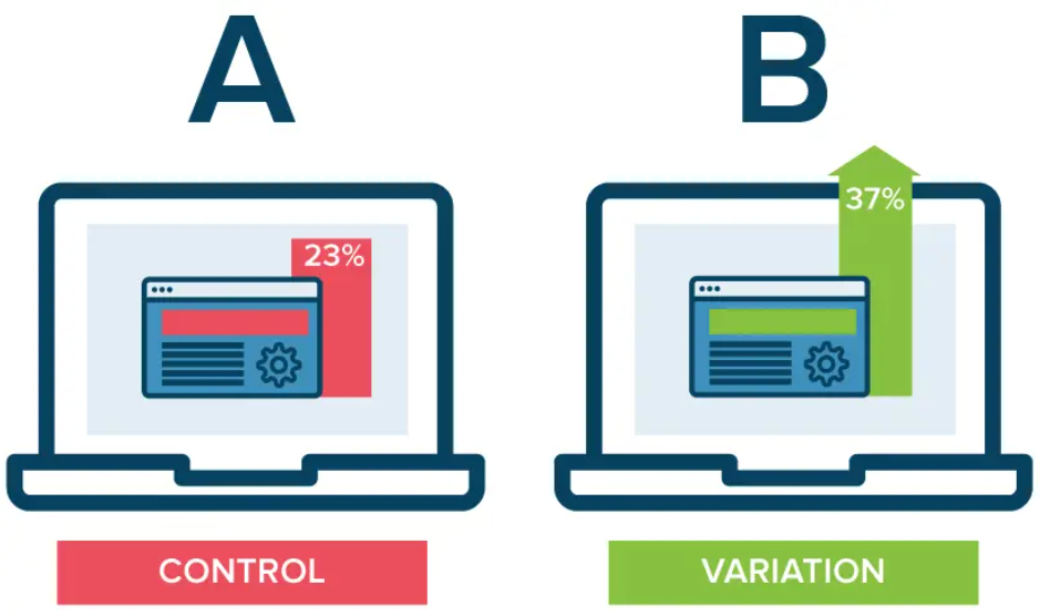
10. A/B Test
Improving the conversion rate of your website gets easier when you start running A/B tests. Testing and experimentation help you compare two variations of a webpage in real time. This allows you to test the tweaks before implementation:
If you want to increase the conversion rate of a landing page, you need to identify an element you want to tweak (based on data). For instance, you want to tweak the headline. You’ll then create a new variation of the landing page with a tweaked headline and then run the experiment through an A/B testing tool.
The A/B testing app splits the traffic between two variations equally and after running the test for a certain period of time, the variation with more conversions should be implemented.
You can run A/B tests to test all the elements one after another on different key pages of your website. The critical elements that directly impact conversions are:
- Headings and subheadings
- Images
- Call to actions
- Color scheme
- Page layout
- Trust badges
- Social proof
- Copy
- White space.
Here’s a list of best practices to follow when running A/B tests for conversion optimization:
- Use data to identify the right variable for testing
- Run one A/B test at a time
- Test one element per A/B test
- Use a reliable A/B testing platform
- Let the test run for some time and only stop it once it reaches statistical significance.
A/B testing is a scientific approach to increasing conversion rate with well-defined steps. You can read more about A/B tests and how to create them in this A/B testing guide.
Final Words
Conversion rate is a core metric that is related to ROI and the growth of your business. A high conversion rate indicates that your website is performing well and pushing visitors down to the bottom of your sales funnel.
Increasing the conversion rate of your website is a technical and tedious task as it requires data analytics, tools, design and coding, and consistency. It’s a continuous process where you should keep tweaking different elements throughout your website to keep improving conversions.
At the end of the day, conversion rate optimization pays off. You get more sales from the same marketing budget and the same traffic.
If you are spending money on marketing, it’s essential to look for ways to convert more visitors into customers. The advanced techniques covered in this article provide you with a good jumpstart into the world of conversion rate optimization.
Featured Image: Pexels